In this blog, I am writing to reflect my concept of the final show of the remote term.
In this remote term, I used Blogger as a sketchbook to post a critical commentary of an exhibition, my initial ideas of the final show & mood board, poster design & my brand logo, media strategy, an artist statement, a blog about my target audience and how do I market my show.
I did not know much about the virtual gallery or exhibitions before the start of this term; just knew it is online, untouchable, similar to the gallery in reality. This pre-knowledge gave me the basic idea of what a virtual gallery looks like that I can imagine a rough idea of my final show. In the first blog of this section, it shows some virtual galleries that I had visited. For example, the V&A museum and the TATE. I have discussed their customs, layout, and information. I think it is good; I have looked at every detail that I can know what a professional virtual gallery would look like and what should be included. However, I think I need to add some words to explain how does this inform and what I might do in my own show. Therefore, I improved this post and added some details about my final show.
Then I looked for particular shows to get inspirations; I researched themes of exhibitions that I interested in and learnt how artists named their show. I had nice ideas of name, but I think they are not dynamic enough. Therefore, I wanted to make a name attractive and also specific to fashion textiles. Although the inspiration was lighting, my show is about fashion and textiles, so I change the title and put 'Garment' in front of lights. Then, it became 'The Garment of Lights'. I think it is much better.
The third step was to design a logo. I wanted to make an improvement base on my previous logo design, so I looked at some famous fashion brands, for example, Karl Largerfeld, Superdry, and UNIQLO. I think it is good that I researched brands that I enjoyed; this means I like the style and I can have a concept of style of my brand logo. I also think it was helpful that I brainstorm ideas using a blank paper. It helped me to think about different combination, content, design of the logo. I have spent a long time to design the logo for the final show. However, the logo does not match my poster and it does not tell fashion to the audiences. I think I should make a colour palette to my logo or make it into different colours, that I can avoid it is not matched. I should not make things separated; to look at the mood board, logo, poster, and collection together. Then they will be consistent. When I was designing the logo, I did not consider the target audience. It determines the fonts, style and colours of the logo. When I considered the target groups, my mind was clearer and know what elements should include. The target people are generation Y, so they are more mature, I should not use an image of a light bulb in my design. Just keep the logo simple. More details about the reflection of the logo, please check the post 'Logo creation 2'.
The reflection of my poster is in the post 'Poster Concept Reflection'.
I have identified social media and demonstrated why I chose them and how they work. To improve, I think I need to research that my target audiences will access this social media. Then I added a survey by LSE. It is a University's research, so it is reliable that shows evidence that my target audiences will access to the social platforms.
Reference:
LSE (2017) Social Media Platforms and Demographics. [Online] Available from: Social Media. [Accessed by 18/05/20]
Tuesday, 2 June 2020
Subscribe to:
Comments (Atom)
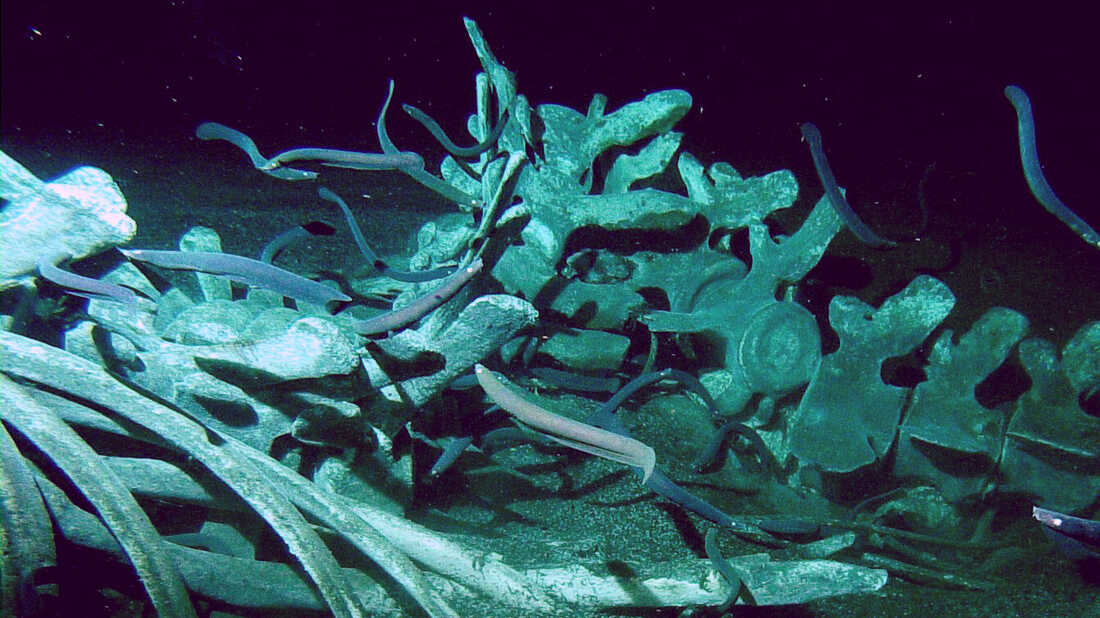
Whale Carcasses
From birth to death, whales belong to nature. These ancient creatures come back to the ocean and their bodies benefit other sea species. Evi...

-
I am designing a poster to advertise my final show. The working process and final outcome of the poster will illustrate in this blog. Here i...
-
This is the sketch to make sure whether the pattern on garment works. I design a Kimono, it is also an element shows Royalty. ...
-
After I finished customising my Home page, I moved on About page to change the image and began to write my Bio. I added my Logo to the left-...


