Showing posts with label AUB 2020. Show all posts

Sunday, 10 January 2021

Development: Portrait & Identity

Artists research:

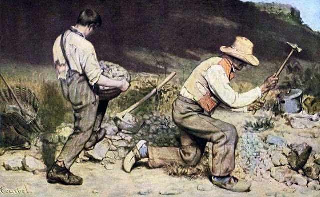
1. Gustave Courbet, The Stonebreakers, 1849


2. Felix Gonzales Torres, Portrait of Ross, 1991


3. Pamela Rosenkranz, Our Product, 2015


Reference:

1. GUSTAVECOURBET (n.d.) The Stone Breakers, 1849 by Gustave Courbet. [Online image] Available from: the-stonebreakers.jsp. [Accessed by 05/12/20]
2. PUBLICDELIVERY (2016) Why did Félix González-Torres put free candy in a museum? [Online image] Available from: felix-gonzalez-torres-untitled-portrait-of-ross-in-l-a-1991. [Accessed by 05/12/20]
3. MOUSSEMAGAZINE (n.d.) Pamela Rosenkranz “Our Product” at the Swiss Pavilion, Venice Biennale. [Online image] Available from: rosenkranz-swiss-venice-2015. [Accessed by 05/12/20]

Wednesday, 6 January 2021

Development: Anthropocene


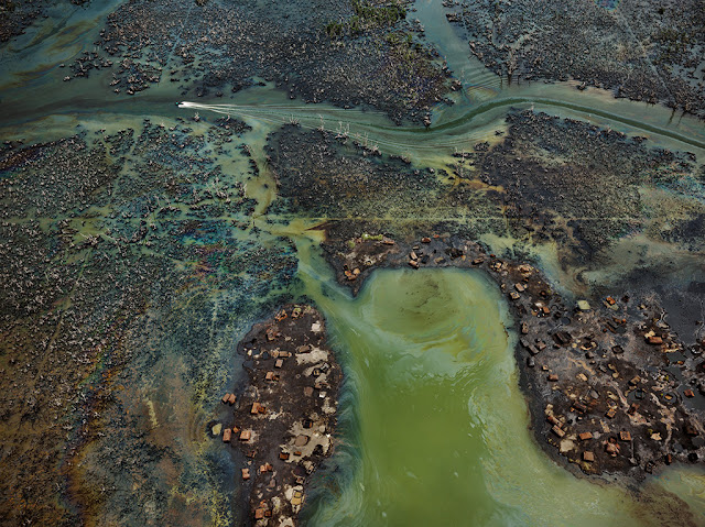
In Nigeria's oil-rich Niger Delta, oil bunkering — the practice of siphoning oil from pipelines — has transformed parts of the once-thriving delta ecosystem into an ecological dead zone, according to the U.N. Environment Programme.

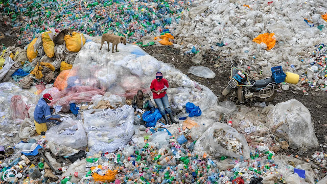
When I was doing the presentation research, I found these heartbreaking but incredible photos. I think death and life, light and dark always exist at the same time. Those pictures look like pieces of art. The 'Plastic Soup' by Pinar Yoldas, it is an installation to reflect what humans have done to the planet; they turned the pacific ocean to a plastic soup. It alerts humans to stop damaging the environment. Then I would like to make work using plastic, or something could be recycled. I am looking for a sustainable future. These two pictures remind me of clay relief, I might try after the 'Elbow' project.

Reference:

NPR (2019) Oh Dear: Photos Show What Humans Have Done To The Planet. [Online image] Availabe from: the-anthropocene-project-captures-humanitys-indelible-mark-on-the-planet. [Accessed by 08/12/2020]

Development: thinkings and reflections

Bear in mind the first Learning Outcome: LO1 – Demonstrate understanding of risk-taking in experimentation with new or unfamiliar media, equipment and research material to generate, develop and transform ideas and artworks.

But also now the second one too: LO2 – Display development and synthesis of your own individual creative responses and communicate your ideas through the use and manipulation of materials and processes with the informed use of visual language. 

I have experimented different media for the past few weeks, not only 3D and 2D traditional media (Oil paint, watercolour, markers, colour pencils, clay, paper, etc), but also natural forms (leaves, rocks, branches, sand, soil.) and editing apps on computer. The materials I was unfamiliar with, such as oil paint, natural forms, paper sculpture, also the technical apps have been surprising me. The oil paints: I have not used oil paint before, therefore the process of discovering was so interesting to me. I was thinking if it is similar to watercolour that the function of oil is the same as water; when I added more oil, the fluidity of the paint increased and dry slower. The medium (linseed oil) gives more time for me to deal with 'mistake' and 'hesitations'. The most significant feature is that it makes the paint more transparent. It is different from watercolour, as it does not leave traces of the water flows, but brush strokes. I like the texture provided by oil paint, especially the linseed oil was added. The surface of the painting is smooth and flatten. In compare, the watercolour is unpredictable and oil paint is more controlled. I found it is a nice material for painting human skin in a realistic style. Even though watercolour can give a thick texture, it is very hard to achieve a smooth surface as oil paint. And it is not easy to be very thick unless less water and much paint. I found the linseed oil is very helpful in blending paints. After several times of experiment, I think the amount of oil should be a third of the paint or no more than a half. If it is over, it would be more like watercolour and the painting leaves traces of oil which is light yellow. I think it was not a failure, it would be something interesting to explore further. I can combine it with charcoal (life drawing) or some stencilling, maybe, it would be a mix media piece. 

In the following weeks, I had a second thought; the topic of this unit is 'Think of material', therefore I change my focus on the use of material rather than content. Getting out of the box, I made my work more experimental instead of illustrating the ideas. I changed all the way of thinking and planning. I usually make a plan in sketchbook what I would like to draw or paint, but now only decide which material to use then start creating. I feel more freedom of creation and found out something unpredictable that surprise me. Consider the situation right now, there are many limitations. So the works are made from something common and basic objects, such as cling-film, foam board and cardboard. I made some lovely marks on the foam board. This idea came from the first day in the drawing workshop, when I was getting marks from different objects, such as the branches. These marks created because of the rough surface, just like the foam board. There are some circles illustrated horizontally and vertically. It is a little bit different which is a manmade product so the marks are very neat and regular. This pattern shows when I apply a thinner layer of paint, therefore it makes the painting more layering. Another piece of work I would like to mention. It is an abstract sculpture, created by some plastic board. I cut it into small pieces and rejoined them together. The topic centres around 'Elbow', the elbow's movement is about 0 degree to 150, in my opinion. So I chose this material, it stretches in a similar range. Also, I would like to make it a metaphor, it can not be noticed directly for the first time it is about the elbow. I think it is good to try that I have not done it before. It is new to me which my works were realistic.

Presentation Research

Q: “Beyond the stratigraphic discussion, the Anthropocene can be felt as a call to re-imagine the human through biology and geology” (Davis & Turpin 2015: p.20). Discuss how two artworks have ‘re-imagined the human’ in this context. 


1. Jae Rhim Lee, Infinity Burial Suit, 2011

Think of the relationship between body and environment


How the Mushroom Death Suit Will Change the Way We Die


“Jae Rhim Lee's work challenges the boundaries prescribed by society and 
culture between self and other by proposing unorthodox relationships for the 
mind/body/self.” — MIT

2. What is the Anthropocene

Reading/text


3. Caspar David Friedrich, The Sea of Ice, 1823-24

wild Nature as a mirror to the psyche of the individual artist turmoil


4. Pinar Yoldaş


An Ecosystem of Excess is a deeply researched, well thought out exhibition. In a world that relies on its oceans to function, activist art like this is a means to make people pay attention. The sad vision of a future that requires adaptation to toxins instead of cleaning them up suggests that many species won't make it, and much of the ocean’s biodiversity will be lost. Pinar Yoldas brings a provoking an urgent subject to light in a scientific and strangely captivating way. It leaves the viewer unsettled, yet oddly comforted by the resilience of life.


5. Reading

‘Introduction’ to H. Davis & E. Turpin (2015) Art in the Anthropocene. London: Open Humanities Press. 


Reference:

 what-is-the-anthropocene.html

how-the-mushroom-death-suit-will-change-the-way-we-die-a52f486dc816

an-ecosystem-of-excess

eco-visionaries-ra-design-exhibition

mushroom-burial-suit.htm

jae_rhim_lee

the-anthropocene-project-captures-humanitys-indelible-mark-on-the-planet

anthropocene-the-human-epoch-review.html

Mini presentation: 2 min describing the q & theory context
2 min Describe analysing the artwork
2 min the other artwork
4  min situating and comparing/ contrasting artworks to theory and question


Sunday, 15 November 2020

Research File: 3D

This blog shows three artists' inspirational works.

1. Phyllida Barlow


Object for the television
1994

It is an impressive artwork by Phyllida Barlow. The sculpture of the rabbit's ears is simple and contemporary. It is contrasting to the old-fashioned television. I think the artist left the original colour and texture of the element is quite interesting. She lets it match the television. If it is a colourful hat or something else, it won't work like this. Also, this kind of decoration is normally used by human. It is the reason why I found it innovative when I see it on objects.


Untitled: Female; 2018

Another piece from Barlow, very different style. The title is about female, but I really can't see the relation. Is it the female looks like this in the artist's eyes? However, the thinness given by the metal pieces is attractive. I like the way how they accumulate together and perform volume.

2. Franz West


Schlieren 2010. © Estate Franz West, © Archiv Franz WestPhoto: David Bebber

Franz West's abstract art, similar to Barlow's Untitled in 2018. I can't really understand but I am interested in the shape of these sculptures. I like he made large pieces and illustrate them outdoor. This picture shows the relationship between nature and manmade art. They are matching together as the background is a part of his work.


3. Erwin Wurm


Head TV, 2017


One of my favourite sculptor. Wurm makes all his art interactive. I like the way that he engraves his drawing next to or on to his 3D works. Also, I like hand drawing so much so that I very like these simple little drawings by Wurm. The most interesting thing is the artist give opportunities for audiences to interact. His works are performing and documenting. Some of his instructions are very silly, therefore people might act different, for example, they do not do anything after seeing it. But who knows, that is the funniest part.

4. Robert Gober


Untitled, 1990
Image from The Met 150

Robert Gober made a pair of breasts of female and male on a bag of plaster. This wax shaped in a bag representing the human torso and there are two pigmented nipples, real hair on the surface. The attractive point of this sculpture is the artist gave a different texture to the human body because of the material. I like the relationship between the human body and fabrics: how the fabric fold and directions it forced by movements. So I think it is a nice inspiration for reference, for example, I can make a coat with a surface like human skin, or make a toast coat. Toast is a daily product, cheap and can see it anyway. It provides energy, is a product to remain life. It has a close relationship with our body. Of course, it will be kind of performance, not really wearable as the bread will be mouldy. 

5. Antony Gormley


Antony Gormley's work in 1980-81, called as 'Bed'. It made by thousand loaves of bread and chewed into being. His wife preserved them in wax and assembled. It looks like a king size mattress. Think of the materials he used, is very unusual and normal at the same time. Bread us a everyday product and the most basic food. According to Cormley, bread symbolises the body. As an inspiration, around the topic of identity and the connection of human body and our lives, I am thinking I might use something like bread as the main material to make my art piece. Rather than create a painting, I think using this kind of objects to create a 3D piece might be exciting. Let's think of the eggshell. Eggs are one of the daily product like breads, the are cheap, so it is quite common to see in everyone's home. The focus of this time project is 'Elbow'. I think it can represent human as a portrait. I found elbows can never be flatten, the eggshell reminds me its shape. At the same time, the colour of eggshell is so similar to human skin. Therefore, I think it will be a good idea to experiment.


Reference: 

1.1. WIKIAERT(2014) Object for the television. [Online image] Available from: object-for-the-television-1994. [Accessed by 08/11/2020]

1.2 RA (2018) unitiled:female; 2018, 2018. [Online image] Available from: untitled-female. [Accessed by 08/11/2020]

3. WEST, F. (2019) 5 reasons to go see Franz West’s absurd sculptures at Tate Modern A major new exhibition of the Austrian artist, known for his bold sculptural tangles, has opened in London. [Online image] Available from: Franz-west-tate. [Accessed by 08/11/2020]

4.1.WURM, E. (2017) ARTWORKS. [Online image] Available from: one-minute-sculptures.html. [Accessed by 08/11/2020]

4.2 THE MET 150 (2020) Unitiles 1990 Robert Gober. [Online image] Available from: https://www.metmuseum.org/art/collection/search/737590. [Accessed by 18/11/2020]

5. MACPHERSON, A. (2019) Antony Gormley: 10 works to know. [Online image] Available from: antony-gormley-10-works-to-know. [Accessed by 23/12/2020]

Tuesday, 10 November 2020

Reflection: MaP workshop

I was new to Premiere, so I practised a few more times after the workshop. I found two videos on Youtube, download them using an internet converter. Then I used Premiere to switch the sound of these two videos. My first experiment was using the fight scene in 'Eva 01 Vs Sachiel' in Neon Genesis Evangelion, and added the music 'Fly Me to The Moon'. The aim is to create something fun, then I did it. This smooth song has a strong contrast with the intense fight. 'Fly Me to The Moon' lets people associate chill afternoon with a nice view of sunset, slow and comfortable song. I used it to change the beat of the fight. I was satisfied if it was the first time. I would like to be more familiar to Premiere then I can make the music match better to the actions. At the moment this video looks like recreated nonprofessionally. I want to show an effect of slow-motion just changing music. If it can not match, I should consider changing other music.

Research File: Life Drawing

1. Dryden Goodwin


Wander, 2014

In the interview, Goodwin said he is experiencing different styles of drawing and he likes to do. As the image shows above, the head looks very different from drawings in traditional ways. These lines more like scratched than drawn by a pencil. The lines crossed and create darkness, where the shadow is. I think this is quite experimental, maybe I can try to use a knife to draw on a plane of airdrying clay. I am not sure if this drawing style is suitable to draw something with smooth surfaces, such as a baby's face.


2.  Leonardo da Vinci


Leonardo's work from the National Gallery, 2020 exhibition
Experience A Masterpiece

Leonardo's extraordinary piece. Traditional paintings always catch my eyes and let me stuck in the world created by the artist. The girl looks so vivid, I barely can feel the emptiness of her eyes. I also shocked by the details of the hair, it looks like every single one is floating in the air. I am not sure if the blue in the background influences me, this girl just like a princess of the ocean and waiting for her love. One reason probably is the light shooting from above, just create a scene under the sea.


Reference:

GOODWIN, D. (2014) Wander (2014) 100 etched stainless steel plates set into the pavement of Cambridge's new bus interchange. [Online Image] Available from: public_art_projects.htm. [Accessed by 01/11/20] 

NATIONALGALLERY (2020) Experience A Masterpiece. [Online Image] Available from: leonardo-experience-a-masterpiece. [Accessed by 08/11/20] 

Research File: MaP workshop

1. Christian Marcley

Link for the artist's work: The Clock

I have been to the Tate Modern and visited this special exhibition. It was my first time to see a show in this particular form; it was like a cinema, with nice sofas and a big screen. The room was very dark, but when the light from the screen shooted on audiences' faces, I can see their reactions. A very different and unique experience. The whole process was confusing because the images or clips were not linked. There was not a storyline. I did not know whether is the atmosphere or influence of other people, I decided to stay for half-hour to watch that video. Even though I cannot understand at all. However, the second time I saw it, it became a little bit interesting. I like the way how Marcley uses the theme of clocks and link those separated clips. The people in the video are doing different things at different times. I always think, human activities are kindly the same: wake up in the morning, have breakfast, a nice afternoon tea, and a rich supper, isn't it? If you are not the person who is a nightguard. In fact, I think people in the world are doing fully different things at the same thing, just like now, it is 9pm in the evening (UK time) that I am writing this blog, but my grandma is ready for to wake up and going to have her breakfast, how amazing. On that side of the Earth, what are they doing? Marcley is an artist, so do I, we are all curious to this world.

2. Hito Steyerl

Link to the video: How not to be seen

This is a video made by Hito Steyerl in 2013, it is a strange and funny instruction short film personally. It begins with a weird sound of a man, talks slowly and like an alien in the sci-fi movie. The title of this video is 'How Not to Be Seen'. It is a good question. I have not thought of it before, so it is quite inspiring for me. If you ask me, it would be 'take it away' or 'hide it'. A simple and straightway. However, in this performance video, the artist shows more than five ways. I did not realize if we can let the object gets close to the camera, then we cannot see it, that's means we make it not to be seen. It is a weird way to educate, but I like it. It actually broadens my horizons in thinking.

Reference: 

YOUTUBE (2019) Christian Marclay - The clock, 2010-2011. [Online] Available from: watch. [Accessed by 06/11/20]

ARTFORUM (2013) Hito Steyerl, How Not to be Seen: A Fucking Didactic Educational .MOV File, 2013.   [Online] Available from: hito-steyerl-how-not-to-be-seen-a-fucking-didactic-educational-mov-file-2013-51651. [Accessed by 06/11/10]


Reflection: Life Drawing

 I have tried multiple new drawing techniques in the class, such as making marks using fingernails on paper, reverse drawing, and using a paper to make a sculpture of a figure. Those are all exciting practices, which helped me understand more about the human body structure, tones, and how to use drawing tools. The most impressive thing is how to hold a pencil/charcoal; I did not know before: when to apply darkness, need to hold at the top of the charcoal which allow pressing harder to give more pleasure to the paper. The way to hold is so different from holding a brush. The reverse drawing also fun; I used rubber to erase darkness from the paper to create shape and volume of the model. It was useful that I exercise to control my hand; how much pleasure to make on paper shows how bright that area is. It means how many charcoal traces I take out form the paper. I found the sketch rubber is actually good to use as it is soft and easier to give the texture of the human skin. Besides, I like the experiment of drawing with a long stick. The charcoal was taped at the beginning of the stick that I need to draw in a fixed distance. The first time I found it was hard to control. It was different from using a pencil to draw, that the strength is from my arm. After I tried several times, I got used to it, although the outcomes were not as perfect as using hand to draw. However, it is a good way to draw and look at the model at the same time. The sculpturing was a bit confusing at the beginning. It is because I have not tried to sculpt a human body before and also the model kept moving, it was hard to capture. So I did it quickly in class. At home I do it looking at pictures, it becomes lots easier. If I have time, I defiantly practise more. Not only sculpt the whole figure, just concentrate on one part, but it might also be the neck, arm, or legs. Then I can try to make details fo the skin. I would like to make wrinkles and smoothness at the same time.

It is very hard to make detail if it is a figure of the whole body. However, I guess if I focus on a specific area, it might works.

Reflection: 3D workshop

Explore ways to transform a material of your choice in relation to one of the following words: boredom, absurdity, control, togetherness, resistance, animal, counterpoint, every day, food. Be expansive and aim to surprise yourself in the process, there are no limits other than not harming yourself nor others, steer away from literal interpretations, embrace imagination and discovery. Repeat this exercise with two other materials. NOTE: see list of artists below for references.


I used a wide range of sources to create my 3D collection; including the natural objects and manmade equipment, such as rocks, flowers, leaves, branches, plastic cup, metal pin, etc. My aim was to use the sources from nature and mixing with manmade objects and see how they go together. When I saw the white plastic tube and the foam board, I wanted to make a collection centre around a theme of plastic pollution. About pollution, an idea of factories came up in mind. The saggy branch looked like grey gas from factories. Then I set my direction for the experiment. I decided not to make a draft or a plan, just focus on my theme and to combine things what I have collected from outside and see what I can get. I also challenged myself not to used glue to stick things, I would like to keep everything original. One example of the collection shows below.


I dug in the foam board and placed the leaves inside. The small branches were plugged on top. They are facing upward that it means these plants growing into foam; also died in foam. It is easy to throw away plastic, foam, trash should be recycled on the ground or into the ocean. So I used a foam board instead of Earth. It represents if people keep damage our planet, then there will be no earth and full of trash like used foam. I am quite satisfied with the process and also the meaning of this art. However, something to make it batter if I can make it larger, and try to make the foam board into small pieces then it will more like Earth. I think it will look great in a glass container. The size might as large as a wall.

Another piece I like is the rocks. I surprisingly found the balance to pile up them. It is interesting to experiment when I was creating this piece. Because I did not know what would be the correct rock to use. Also, it will be an interactive 3D artwork for audiences.


Sunday, 8 November 2020

Reflection: Painting

 Reflect on your processes and outcomes from the workshop. Describe what you made. What was successful about this and why? What could you pick up to develop further?

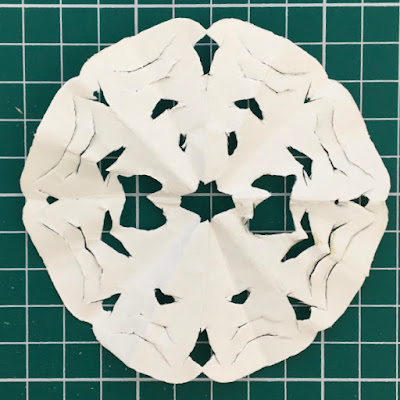
I had tried out the Tarot cards, created a sigil, automatic drawing, telepathic drawing, and paper cut. The aim of the Tarot cards was to influence how I devise drawings; I picked up three cards, in an order to represent my past, present and future. It was the first time to play Tarot, however, it actually influenced me psychologically. When the sign of the card was positive, I felt more confident to draw. Conversely, I felt worried. I found it might change the style of my paintings, how interesting. I also created some logos by overlaying the letters of my name. I was not very interested in it, but I think it might be a useful skill for logo design in the future. The automatic drawing was full of unknown. I was a bit confused and I did not understand when I saw the outcome. I think there will be some meaningful marks if I do it with music, combining the technique 'draw to music' in the drawing workshop. Because the lines were done in unconsciousness. About the telepathic drawing, it was fun. Since it was the first week, this activity gave an opportunity to familiar to my partner; to observe her face. Sometimes I depend on my feeling and habit to draw, the telepathic drawing led me to use my eyes to observe. I think it was a very nice practice of observation. The paper cutting was the most interesting. It is unpredictable and allowed me to develop my creativity. I made a very simple paper cut at the beginning and I was not satisfied with it. Therefore, I had thought about before I started; how many folds I want to create and how many details I would like to apply. As the result, there was a more satisfying outcome. The patterns repeated following by folds, so the second sample has more details as there are four-folds. Also, the thinner paper is better for a paper cut.


Wednesday, 4 November 2020

Research File: Painting

1. Agnes Martin 


Untitled #5, 1994

This painting made by Canadian–American artist, Agnes Martin. There are eleven bands of white, blue and peach acrylic paint. It is consists of regular repeated patterns. The whole image is bright which gives a visual sparseness and vibrant luminosity. This brightness and effect come from an opaque coating of white acrylic gesso on the first layer; This layer can not be fully covered. This is the reason why it is interesting. I feel like I was looking through fog lights, however, it is the effect of the paint itself. It might be a good reference to experiment.

2. Russell Crotty


Martian Paradox, 24:3, 2018


Exo Hab, Nitrogen Haze, 2017

Russell Crotty's works give a feeling of aliens; I can tell directly from the images that they are about exoplanets. The outcomes show his fascination with the world beyond human society. These paintings underlying the overdevelopment of the Earth, for example, toxic industries, issues of global oil infrastructure and the deterioration of our environment. The early art movements have influences on his works, such as Surrealism, Finish Fetish, process experimentation, Modernism and Sci-Fi. (Crotty, 2018) I am interested in his materials. I found mix media always attracting. The 'Exo Hab' is an ink painting on paper, with threedimensional plastic on the surface. It is interesting that the audiences look at his painting through these plastic pieces, just like looking through the glasses of a window and the glasses of an astronaut's helmet. I like the way how he divides his small paintings using black fine lines. They look like illustrations telling different stories. Looking into the whole abstract shape, it looks like a creature, or it is not? It reminds me of the animals with thin long legs in Dali's surreal art.


Salvador Dalí (1904-1989)
Chevauchée céleste


3. Ellen Gallagher


Paper Cup, 1996

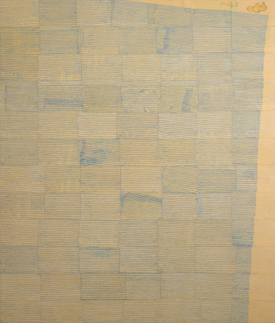
This is a large-scale painting made by multiple layers of line paper segments. It shows a combination of geometric abstraction and hand-drawn elements. Gallagher used 84 pieces of yellow paper to cover the surface of a canvas. These papers wrinkled when they were glued. Then a layer of blue ink drawn by hand. 'at close range is revealed to reference a racist and outdated minstrelsy idea of blackface physiognomy: a minuscule pair of rubbery lips repeated thousands of times and loosely following the lines of the paper.' (Tate, 2020) The points that made this work successful are the papers, ink and glue. When the artist layered these small sheets of yellow paper, he gave texture on the surface of the canvas. Then the glued paper had its own experimental outcome, which the traces and shape were unpredictable. Also, the link overlaid dried, and the edges of the papers showed up; it also shows the gaps between; areas of overlap producing irregular grids.

4. Justin Duffus


5. Chris Gambrell


Something a little minimal in pastels on Fabriano at around A4 size.


Reference:

TATE (2020) Anges Martin Untitled #5 1994. [Online image] Available from: martin-untitled-5-ar00177. [Accessed by 04/11/20]

CROTTY, R. (2020) College Works. [Online image] Available from: bioresin.html. [Accessed by 04/11/20]

TATE (2020) Ellen Gallagher 1996.  [Online image] Available from: gallagher-paper-cup-ar00066.  [Accessed by 04/11/20]

CHRISTIE'S (2020) Salvador Dalí (1904-1989). [Online image] Available from: salvador-dali-1904-1989-chevauchee-celeste-5915657-details.aspx. [Accessed by 09/11/20]

DUFFUS, J. (2020) detail/demo/wip. [Online image] Available from: justinduffus. [Accessed by 23/12/20]

GAMBRELL, C. (2020) Something a little minimal in pastels on Fabriano at around A4 size. [Online image] Available from: gambrell. [Accessed by 23/12/20]


Research File: Painting

 This blog shows some research for the paint workshop. It includes information about the cave painting, Pompeii frescoes; Also about the artists, Frank Auerbach and Giorgio Morandi.


1. Altamira Cave

It was discovered by Marcelino Sanz de Sautuola in the late 19th century in northern Spain and it was the first when prehistoric paintings were discovered. People doubted of forgery because of the notable quality of this cave painting, they did not believe people in the past could create high-standard artistic work. It was acknowledged as real until 1902. The objects and creatures in this painting are among the best-preserved cave paintings in the world. (Touropia, 2020)

More information about the cave painting: It is for symbolic and religious purpose. It is similar to petroglyphs and engraving, as a type of parietal art. Cave paintings could be found on walls and ceilings.

It is not a surprise for me of people's doubts about its authenticity. When I saw this picture I was shocked by its vivid and bright red colour of this bull. It does not look like an ancient painting from ages ago. I feel so astonished of people's intelligence- how did they make the colours maintainability?

2. Pompeii fresco

The German archaeologist August Mau (1840-1909) described the excavation of Pompeii wall paintings was one of the largest group of surviving examples of Roman frescoes. There are four periods (Incrustation, architectural, ornamental, and intricate.) of the Pompeian Styles and they are distinguished in ancient Roman mural painting. Roman colonized the ancient city of Pompeii since 82 BC. Then the eruption of Mount Vesuvius happened in 79 AD. It destroyed the city and preserved the paintings. After the excavations in the 1840s, a large number of murals showed that Pompeii was an economically prosperous city and the paintings also tell a great deal about the prosperity of the area and specific tastes during the times.

A bit different from the Altamira cave paintings, the main aim of these Pompeii frescoes was to reduce the claustrophobic interiors of Roman rooms. The paintings brighten up the windowless and dark rooms to make them more spacious and full of colours and life.

From the past to the modern, art is always a good way to document our life. I am delighted that the paintings were preserved after Mount Vesuvius. Although we can know about the great city of Pompeii from words, I prefer to 'see' it visually. Pompeii fresco does not only allow me to know about the activities of people in that period but showing the changes in painting style.


‘Portrait of a Woman’, via Ancient History Encyclopaedia
Image from Hayward's article

This is an example of Pompeii Fresco. Females held low social status in the Roman world. However, this Pompeii fresco shows a woman holding a pen and a writing board or book. It is rare to see a woman receive an education. I am curious about her life and identity and this image became unusual and fascinating. (Hayward, 2020)

3. Frank Auerbach

Frank Auerbach, 'Portrait of Catherine Lampert', 1981-82
Tate


Frank Auerbach, 'Mornington Crescent', 1965
Tate

Frank Auerbach does not visualise the pictures and he works on his previous work in the early year. That is the reason why his paintings have a thick surface. Since the 1960s, his works were done in one go that he changed the way to paint. He experimented many times with judgement until the final version. 'For practical reasons, he does not paint landscapes from life but rather works from drawings created on-site.' (Tate, 2020) 

Auerbach cited his admiration for master painters including Rubens, Picasso, Rembrandt and Constable. According to his painting style, it is obvious to see Picasso has a big influence which the paintings have bold strokes, the colour palette of complementary. I am interested in his way to use paint. He shows the movement of the brushes and also sculpts the images with paint.

One thing he learnt from Rubens, I think is the proportion. 'The Raising of the Cross', one of Rubens's well-known art pieces. It is notable that this talented artist's ability to fill the picture with figures, without the composition seeming over-crowded. 'There are fully nine men straining to erect the cross, and despite the taut muscularity and the extreme physical effort the image projects, there’s no sense of chaos. Instead, what’s projected is the weight of what’s being done … the physical weight of Christ’s body and the heavy wooden cross, as well as the spiritual weight of the crucifixion of the Savior.' (Artgreek.art, 2020) I did not notice that this picture fits nine muscular men without counting. The artist seems to hide the volume of human and the wooden cross. Although the weight of the cross and Christ's body is forcing to the left, the men are pulling to the right, it tilts the balance and also make the vividness to this painting. This is the wisest thing in Rubens' work. This feature reflects on Frank Auerbach's 'Mornington Crescent'. It consists of thick strokes, however, it does not look crowded.


Peter Paul Rubens, The Raising of the Cross, 1610, Center panel. Our Lady Cathedral, Antwerp, Belgium

4. Giorgio Morandi


Still Life, 1946


Still Life, 1960

I like Giorgio Morandi's Still Life series. He uses flattened colours to the background and thick heavy volume paint to draw objects. This contract makes his painting recognisabkle. His colours combine smoothly together that I guess he mixes conplentary colours to create the shadow. The colour palette of his paintings is very comfortable and the images look clean.


Still Life with Very Fine Hatching
1933

This drawing drew by Morandi carefully, very fine hatching as he introduced. The light and shadow look so smooth and the crossing lines might not be noticed unless you see it close. I like the way how he builds distorted edges. He only applied tones but no outlines. However, the charming point is these vivid edges. 

This blog shows three different artists. Frank Auerbach's art are abstract and casual; Rubens's is classic, showing strength; And Morandi's are more elegant and clean.


Reference:

TOUROPIA (2020) 10 Prehistoric Cave Paintings. [Online] Available from: prehistoric-cave-paintings. [Accessed by 03/11/20]

HAYWARD, L. (2020) 8 Of The Most Incredible Fresco Paintings From Pompeii. [Online] Available from: 8 of the Most Incredible Fresco Paintings From Pompeii. [Accessed by 03/11/20]

TATE (2020) Who is Frank Auerbach? [Online] Available from: auerbach-introduction. [Accessed by 03/11/20]

ARTGREEK.ART (2020) Art in Context: Peter Paul Rubens’ Altarpiece, The Raising of the Cross. [Online] Available from: art-in-context-peter-paul-rubens-altarpiece-the-raising-of-the-cross-69ef64f928f1. [Accessed by 03/11/20]

TATE (2020) Giorgio Morandi. [Online image] Available from: giorgio-morandi-1660. [Accessed by 03/11/20]

Sunday, 1 November 2020

Reflection: Drawing


After the drawing workshop, I am writing this blog to reflect the work I have made by thinking about the following questions.


- How have you chosen to interpret and approach the workshop/ set experiments?

I have experimented all exercises at the beginning. Some of them were new experiences for me; to consider what can these materials teach, what do I enjoy the most, and what did I miss before, etc. The reason why I didn't choose only one to do is if I keep doing something I used to, then I will not able to discover new things and cannot explore my creativity. After the first experiment, I'd like to choose one section that I most interested in. This specific section might process into something else that I can keep exploring it. In the end, I have chosen 'draw to music'.

- Describe what have you done.

The aim of this exercise was to get out of the box so that I decided not to draw too carefully. I would like to do this exercise as experiments. I prepared 14 papers for this two-weeks exercise. Then I chose different types of music, for instances, classic, pop, rap. I repeated the music ten times to let myself understand the music. After that, pictures of a story or some geometry, lines, or colours might come up in my mind.


- Which materials have you experimented with and why?

I used pencils, fine-liners, ink pens, and watercolour. I used a pencil at the beginning which I pretend to make mistakes that I was drawing carefully. Then I wanted to make harder lines; I tried different sizes of fine-liners and also applied colours by ink pens. Apart from experiment lines, I used watercolour to draw larger images. I would like to use a variety of materials to provide textures. Refer to the artist research, I wanted to use watercolour to create some vivid pattern like Julie Mehretu's art.


- Which processes have you experimented with and why?

I tried to get marks from some rocks, branches and leaves, which I applied black dust on the paper by using charcoal sticks. I want to use natural material wisely into my artwork. However, it was not very successful that the charcoal layer was too thin that I could not get clear marks from those objects.


- What do you consider to be successful in what you have done? What makes it successful?

I think it is the right decision to listen to the music several times. It allows me to understand it better. Also, I have seen the meaning of the words to know what is the song about. These actions led me to be more clear on what to draw.

- What do you consider to be failures? What makes it a failure?

I think the only barrier is I was not bold enough. I follow the steps as usual: make a draft, think about it deeply, then draw it, erase it, draw it again. I made things too carefully that I might lose a chance to develop ideas.

- What has surprised you in the work?

One exercise is to draw a bike from memory. I only can draw it from one angle. I shocked that it reminds me that something we see every day, it doesn't mean we remember it. It is all about observation, the human mind sometimes lies to ourselves, we think we know what is it looks like, however, it's not. That's the reason why we can draw it with a picture but not from memory.

- What will you pick up to develop further and how? 

I will develop the music drawing further. I think Julie Mehretu's drawings give me a lot of inspirations that I would like to explore more pattern making using the media as she uses in her works.

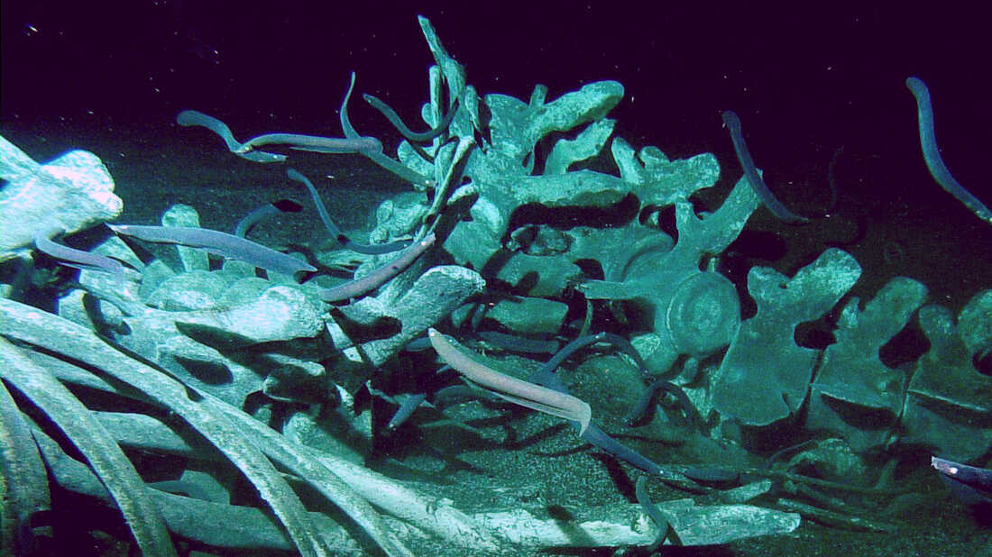
Whale Carcasses

From birth to death, whales belong to nature. These ancient creatures come back to the ocean and their bodies benefit other sea species. Evi...