
There was more than 90% thought the customisations of the Home page is Good and excellent. Only 7.1% think it is okay. I asked some of them that they think it is too simple with white background. However, I decided to keep it like that. It is because there are too many colours of my textiles work and I do not want to mess it up with the background.

It was 21.4% of them think my gallery is not convenient. It probably is the problem of buttons. I realised there are too many, but it is the best way I can illustrate. I still need to learn how to make a good website.

A little proportion of them thinks more description is needed. I will get back to my work and added information.
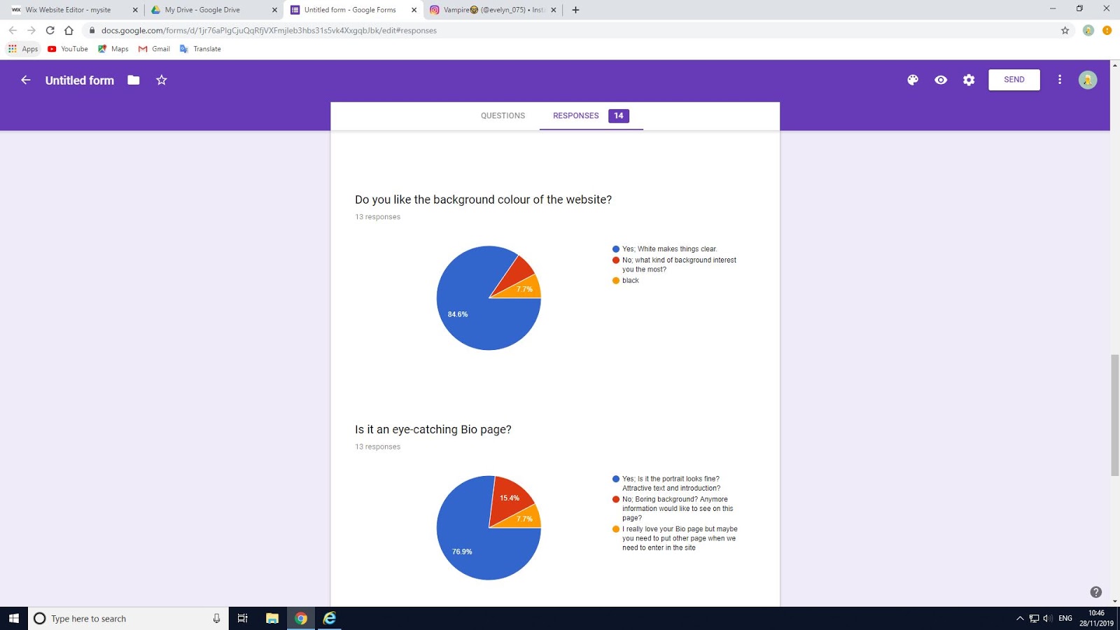
A comment claimed that I set the Bio page as the Home page. Then I changed it afterwards. It is a very helpful questionnaire, I did not realize this problem.


Also, one of the suggestion said that they cannot assess the social media at the bottom of my site. It is also one of the parts I missed. Then I added links to them using rectangle in Shape and set a low opacity that the shape will not cover the text above.


Furthermore, I made the text on the Bio page bigger that it is clearer to see. Here is the mobile version.

I think it is better and more looks like a completed website now. However, I think I should add a comment blanket after each question that people can give me more details of what they think about my website.


Good work - well done
ReplyDelete