Tuesday 3 December 2019

Website Creation: Final Reflection

I changed some parts of my website to make it simpler and easier to navigate. Then I concentrate on drawing new final pieces for my major project. After I created a flip book for these final design pieces, I found they do not related as shared the same topic.

A link to Yumpu Book: https://www.yumpu.com/en/document/read/62943152/a-flip-book-colour-emotions.


Therefore, I spent some time and started to sketch out a new collection. Due to limited time, I decided to keep it as simple as possible. I chose Black & White as the starting point. Black & White look like the simplest colours, however, they represent various emotions. As the pattern I have used in the deigns, the element of zebra shows a feeling of calming. Besides, the hand-drawing circles shows anxiety. I found this inspiration, then used different size of black fine liners to provide several textures. My previous designs give the viewers some confusing and inconsistent, in order to let them understand mt idea and narrative of my designs, I changed the whole colour tone and made the style of these drawings more related.


I found the Yumpu Book does not flip, so I created another software to create a new flip book, the Flipsnack. A GIF version of my design shows above.

I felt more satisfied with the new designs, especially when it shows on the flip book. A slightly improvement can be seem, I used similar patterns or the exact same marks in all the pieces, therefore it became more easier for the viewers to get into my ideas. One of the reasons is that I reduced the number of words. It is important to just show main ideas in this mini portfolio. I found if I include too many information, it might confuses the readers. It is not an academic book or an article in a newspaper, therefore the large number of explanation is unnecessary, just need to highlight techniques of the garments.

Inclusion, I am satisfied with the beginning about the processes of artists and designers' research and how I used the inspirations I found to my works. Also the way to keep looking and testing the website that I made so many improvements. However, I should remind myself that think about the outcome of the works what will be presented to the public. Not only need to concentrate and spend too much time on only one of them, think about the whole section and if they will work together. Unless I might waste time on repeating myself from failures.

Here is the link to my final version of the flip book: https://www.flipsnack.com/elin75zero/yumpu-final-version.html. Also, it is showed on my website: https://elin75zero.wixsite.com/mysite.

Monday 2 December 2019

Website Creation: Reflection

Firstly, I realized there are too many pictures in my gallery that I created more pages in Menu, hidden them and add buttons to link back to the Gallery.


I received feedback from my gallery that a part of the viewers think the Gallery include too many works and it is not clear. Therefore, I deleted all the images and replaced by three representative pictures.


I think it looks more organised now. These three pictures obviously show specific topic of the mini gallery link to.

I also deleted message box at the bottom and other unimportant links of social media.


Also, I think the Feedback page is not necessary to show in the main menu. Then I changed it as a subpage.

At last, I have gone through all pages on my website and edit their position. I found some of them, especially the Bio page, there is a large space between the main body and the footer. Therefore, I reduced them to make my website more organised. Still finishing the major project, will be posted on the next blog.


Sunday 1 December 2019

Feedback & UX Testing

I created a questionnaire on my Google Drive to receive feedback from my website and made improvement based on the advice.


There was more than 90% thought the customisations of the Home page is Good and excellent. Only 7.1% think it is okay. I asked some of them that they think it is too simple with white background. However, I decided to keep it like that. It is because there are too many colours of my textiles work and I do not want to mess it up with the background.


It was 21.4% of them think my gallery is not convenient. It probably is the problem of buttons. I realised there are too many, but it is the best way I can illustrate. I still need to learn how to make a good website.


A little proportion of them thinks more description is needed. I will get back to my work and added information.


A comment claimed that I set the Bio page as the Home page. Then I changed it afterwards. It is a very helpful questionnaire, I did not realize this problem.


Also, one of the suggestion said that they cannot assess the social media at the bottom of my site. It is also one of the parts I missed. Then I added links to them using rectangle in Shape and set a low opacity that the shape will not cover the text above.


Furthermore, I made the text on the Bio page bigger that it is clearer to see. Here is the mobile version.


I think it is better and more looks like a completed website now. However, I think I should add a comment blanket after each question that people can give me more details of what they think about my website.

Tuesday 26 November 2019

A link to Yumpu Flip Book

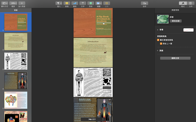
Here is the work process of creating a presentation about my major project. I made this presentation and all customisations in Pages on my laptop.


I changed the texture of this in PhotoScape X and set a lowe opacity that viewers can see the text clearly.


I made two more backgrounds. These colours relate to my works.


I uploaded these pages to the Yumpu website and filled some basic information.

Here is a link for you to see the FlipBook, https://www.yumpu.com/en/document/read/62943152/a-flip-book-colour-emotions

Sunday 24 November 2019

Major project: Final pieces


This is the sketch to make sure whether the pattern on garment works. I design a Kimono, it is also an element shows Royalty.


It can not show clearly here. I enlarged the pattern and made it as a background. Then I rubbed out the first layer which the layer underneath showed off. In order to make a difference, I set the second layer with a lower opacity level.

The outcome does not look good enough here. I changed the background in black to help the garment stand out a bit. Also added a 'crest' at the bottom of this garment. I am still considering whether the wool/yarn combines well with the feathers on actual work.


I got the idea of using real feathers was inspired by this photograph. I took it in V&A Museum when I was travelling in London.


This is my favourites piece. I used pattern of zebra for the jumper at the top. And I changed the size of my pen to create different textures. Also, the black see-through tight tilts the balance between black skirt and long whit dress.

This piece I combined all elements. Butterflies, Zebra and cheetah.


This one is specifically based on the butterfly's pattern. Still working on, will be added later. Besides,  I will add all these final pieces to my website gallery, also make a presentation through Yumpu Book.


Major project: Final pieces work process

Some screenshots here to show new techniques I learnt and how I apply them to my designs. The final pieces will be shown on the next blog.


On the first layer, I sketched out a figure on iPad Pro, Sketchbook (app).


Then, I created the second layer and added drew a garment design.


On the third layer, I started to add colours. This is a new tool I found in Sketchbook, it called ' Linear Fill'. It provides transitions of colours.

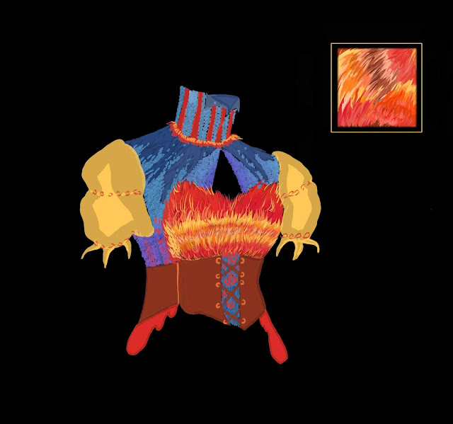
I decided to use the pattern of the sun for the top.


I think the colours are too bright, then I reduce to a lower opacity.


In case something happened, I did all the experiments on another layer.


Moreover, I wanted to show what pattern I have used on the side columns. Therefore, I used the 'Lasso' tool to cut a section out of the belt. It is something similar to the 'Magic Wand Tool' in Illustrator.


Then I dragged it out.


I copied and pasted it to another layer.


It does not fit in the circle. I changed the opacity level and it let me rub the extra bit out as I can see where is the edge of the circle.


Same method for others.


Then I will move on to the next post and show six final designs. Also, I will add descriptions to them that you can see how I develop my ideas.

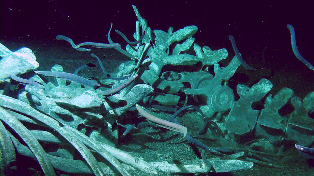
Whale Carcasses

From birth to death, whales belong to nature. These ancient creatures come back to the ocean and their bodies benefit other sea species. Evi...