Saturday, 11 April 2020

Final Show: Logo Design

This blog illustrates some ideas of my brand logo design. First of all, the picture below is the previous version which I designed for my website. For making improvement, I have looked at some famous fashion designers' brand logos and see how they work.


I brainstormed for the brand logo. Here is the sketches.

One of my favourite fashion brands is Karl Lagerfeld. Its logo looks very simple. As Karl Lagerfeld is one of the most celebrated designers in the 21 century, this logo includes his head in letter 'K' in his name. It is a quite smart idea to design a logo.

For my design, I change the idea of Karl Lagerfeld's logo. I made my name as a human face which combined by two Chinese characters '空白' and the meaning is 'empty'. The characters are in two circles, looks like a stamp. I added '空白' in Japanese underneath and also the year I created my website. 

This idea came from a Japanese animation, 'NO GAME No LIFE'. I very like the main characters,'くうはく', then I have used this name as a nickname for many years. Here also from an inspiration of a brand, 'SuperDry', where it also mixed the Chinese and Japanese in the brand logo.


I made a questionnaire for my sketches of brand logo designs and this one is the most popular. The idea of squares is from one of my favourite Japanese clothing brand 'UNIQLO', with bold text and sharp colour background.


Since 'くうはく' means 'empty' and 'nothing', there is a concept. The aim of this brand is to make anything be possible and always creative. Just like adding text to a blank paper. These squares just like digital files in laptop. The number is infinite and all about creating. I continued to use purple as my theme colour.
These two logo does not show my subject area well- Textiles Fashion. Then I created a more simple and direct logo specific for the final show, using 'Sketchbook' on iPad Pro. I simplify my name 'Evelyn Chow' to 'EC' and create a symbol. I  used the original colour palette from the final outcome, so it looks matched to the whole theme colours of the show and the poster.


I also tried to create a brand logo online. There is a platform called 'Brand Crowd'. It is quite convenient that there are two search boxes. I can fill a subject and my brand name there and it will show design ideas in relation. I wanted to find the similar colours to my project, it was difficult. Here is the final version by using the website. Compare to the last one, I prefer the one created by 'Sketchbook'. It is still a nice try to use different tools.


Reference List: 

LAGERFELD, K. (2000) ABOUT THE BRAND. [Online image] Available from: about-us [Accessed by 11/04/20]

SUPERDRY (2020) About us. [Online image] Available from:  https://www.superdry.com/component/content/article/823 [Accessed by 11/04/20]

UNIQLO (2020) UNIQLO UK. [Online image] Available from: https://www.uniqlo.com/uk/en/account. [Accessed by 11/04/20]

BRANDCROWD (2020) Sewing Ideas Logo. [Online image] Available from: BrandCrowd. [Accessed 29/04/20]

Tuesday, 7 April 2020

Art Portfolio: Initial Intended Outcome

This blog will analyse how the work I have expanded in Milanote and Pinterest inform my designs. I also will plan an initial intended outcome for five pieces work.

My ideas change by research, the development process will be given here.

When I looked at Tomaas's series of photo-shots, 'Plastic Fantastic'. I was attracted by quality of the women portraits. This is a set of studio photographs and he used ' Low Key'. Plastic is a very normal thing in our life, it is not noble as gems or jewel. However, he made them structural and innovative, combine with high-standard photography skill, very out standing work. He captured the feature of the plastic bottles and straws which is stretchy and see-through.

I wanted to create four pieces for digital drawings for 2D section and choose one favourites to create a 3D final piece. Then, I would like to use the skills I gained last term. Drawings might change to professional photo shots and the 3D work would be a mixed media picture where I sew over it. I think is it a good idea that I can apply the photography skills from last term and also relate to my progression route, which is textiles that I might use embroidery and beading.


I am still think the flexibility and whether it is possible to archive. I am considering materials I got at this moment. I have a camera, some plastic bag, a wrap of cling film, pot noodle, etc. The only problem is a studio is needed, quite worry about the quality.  More idea will be posted.

Reference List: NOORATA, P. (2011) Plastic Fantastic Fashion Wonderland. [Online image] Available from: https://mymodernmet.com/plastic-fantastic-fashion-wonderland/ [Accessed by 07/04/20]

Sunday, 5 April 2020

Art Portfolio: Initial ideas

In this blog I will note down initial ideas form my major project for the remote term. I will use Milanote to organise those ideas, including artists and designers research that relate to my theme.


I have chosen the first topic, which about plastic. Therefore, I searched different forms of plastic art as brainstorm ideas using Milanote and Pinterest to pin these ideas.


Milanote is better for referencing the designers' work and Pinterest is a tool allows me to look at different ideas in a quicker way, it is more convenient.

In order to link to the topic, I was thinking using plastic bag as the major material for my project which it is an everyday object. Thinking about the situations that I don't have many tools to create a completed garment, such as sewing machine. Then I decided to make something in smaller scale, maybe a small wall hang, a pair of ear rings, a fashion bag for women, etc. This project will include four 2D pieces and one 3D work. The 2D pieces will be a series of design and I will choose the best one and continue to create the 3D work as the final outcome.

I will blogging more posts to show working processes as a sketchbook where includes my sketches, ideas development and final pieces. I am still thinking want going to make, will post it later.

Saturday, 4 April 2020

Final Show: Initial ideas

I will note down some initial idea for my exhibition in this blog.

Ideas for the name:
1. Lighting & Fashion Show
2. Lights up 
3. Wearable fore lights
4. Shining Clothes
5. Wearing lights on
6. Light Chasers
7. Light upon clothes 2020, Fashion Textiles
8. Want to be the brightest star? Evelyn Chow has wonderful light suits for you.
9. Adding magic on clothes: Evelyn Chow's new collection
10. The garments of lights

In order to create a dynamic name that reflects on my work, but that also piques people’s curiosity. I searched for more virtual exhibitions online and looked at articles of ways to name my solo art show. For example, IMMA museum. I found the titles of those exhibitions include time and they are normally long and seem to be more attractive.


For inspirations and brainstorming, I also moved further to look at artists' exhibitions that I interested in.  An example, Japanese artist, Yayoi Kusama on TATE website.


Her exhibition title starts with her name in capital letters, followed by the name of the show: Infinity Rooms. It is short and looks simple, but very interesting. In my opinion, I will be very curious if I did not see the artwork. I would think about what is the show about. Same here, a date for the exhibition.

Reference List: TATE (2020) Yayoi Kusama: INFINITY MIRROR ROOMS. [Online] Available from: yayoi-kusama-infinity-mirror-rooms. [Accessed by 06/04/20]
IMMA (2020) What's on. [Online] Available from: whats-on. [Accessed by 06/04/20]

WIKIHOW (2020) 3 Ways to Name Your Solo Art Exhibition. [Online] Available from: Name-Your-Solo-Art-Exhibition. [Accessed by 06/04/20]

Thursday, 2 April 2020

Final Show: Virtual Gallery Visit

I have visited the V&A website and I will discuss critically its galleries in this blog.


Here is the front page of the V&A online museum. Firstly, I think it is a very clear and nice Home page. The Menu is categorised, clearly shows options at the top. The spotlight research is also added on the right hand side on the top, which convinces the viewers to look for a specific topic or question. The information provided is completed, including ongoing collections, welcome post, opening time, tickets, brand logo, map and address, etc. This website is very easy to navigate and earthing list clearly. It allows the viewers to find information easily, for example, they don't need to access to another website or page to look for ways to get to the museum.

To inform my own website, I would apply a big and clear title at the top. (my brand name) Then keep the menu as clear as possible, which I can hide some pages, such as the questionnaire. To invite audiences, I can make a similar front page as the V&A's. I would like to add a welcome slide and put a link to my new collection to show the latest information.


The museum provided different methods for people to go to the destination which I think is very convenient. If I make a real gallery, I think I also need to provide this information; to make sure helping people to find the location.


The V & A museum also added social media for their updates. Viewers can find the latest information from here. To update information and interact with people, I would add own social strategies at the button of my website.


For people who want to get the latest news from them can enter their email address in the box here. I think the V & A website is very considered that there are many ways to promote their art news and information.

In the welcome slides, I will not only add the newest collection but also other collections.


Not only to access pages at the top of the website, but also at the end. It is very user-friendly and considered. Also, a button to get to the top, nice idea.

For the customisations of this front page, I think it is fine. Firstly, a nice background where the designer makes a low opacity that I can see the words clearly on this website. Besides, interesting brand design. It might be a bit boring if they use the same design for the brand logo on the same page. I like the idea of how they change the logo design and make this page more interesting.

The gallery page is also clearly illustrated in different collections. The icon picture of each collection is standing and the design of background colour is very creative that it changes when the viewers access to different galleries. So I would like to change each page colour of my website pages to make it more interesting.


A few pictures are showing in the Fashion gallery which I think is too less. However, I like the size of each picture that I can see the image clearly. If I make a gallery for my collection, I would use a similar way to display my designs.


When I want to find more information and it was a little disappointing.

This page is boring and like an academic source page. For an art museum standard gallery, I expected more fantastic designs, such as the front page. This page for me loos like Wikapedia website. I think fashion collections should be latest and well presented, like Vogue.


Reference List: V&A (2020) Fashion. [Online] Available from: https://www.vam.ac.uk [Accessed by 04/04/20]
LANDER, L. (2020) First Telfar Took New York, Now It’s Going Global. [Online] Available from: telfar-interview [Accessed by 04/04/20]

Wednesday, 1 April 2020

Art Portfolio: Reflection of Term 2

This blog is to reflect my assignments from last term.

For my major project, I got a very bad grade and it was quite disappointing. Fist of all, the instruction of my website is unclear. I made two slides for this project where the first slide is a photo gallery and followed by a link to my project flip book. I thought those pictures of lights may let viewers understand better to my topic. However, it makes the website difficult to navigate. Therefore, I think I should go to look at more designer's or artist' s websites to learn how to customise my site, or keep it simple, only portfolio for one page. It may be less confusing and easier to navigate.


Then I deleted the photo gallery, only portfolio for this page.

Secondly, my portfolio is still too wordy, even though it is better than first term. This is another skill I need to improve, to make my analysis more minimal to display. There is a method discovered during the Easter holiday which I can look for examples on website, such as Adidas. There is always an introduction of the product and I can learn the way how they describe and what is important to be included.


As it is a portfolio, I think a minimal introduction for the materials is fine, not many words needed.

Thirdly, a clearer introduction and ideas are also needed for my future project. Every explanation need to be clear and direct link to my project. Less confusion for viewers that they can see how I use the inspirations form designers and artists. I think I should spend more time at the beginning next time to plan what exactly to do to avoid less confusion. For the presentation in term 2 I seen be a little bit 'greet' and want to include all my work in. However, there are 45 slides in Power Point and when I was presenting I lost the focus. For example, I should consider all elements need to centre around my progression route which is fashion and textiles.

Tuesday, 31 March 2020

Art Portfolio: Welcome to a Remote Term


Welcome everyone to the new remote term.

My works for this term will change to online and all subjects will be done digitally. My research and working process will be shown here and I will also illustrate pictures of sketches and final pieces for each section. This blog will be updated frequently. I aiming for more creative ways with my project and improve my skills in digital art.

It was a very special Easter in 2020. Due to the Coronavirus, most of us stay indoor for quarantine. Therefore many activities only can be finished insides and the one way we keep in touch with the outside of the world is internet. However, it allows me to stay in calm. I think in a more depth way to reflect all my mistakes, for instance, how to work smartly. I like details and delicate art, which is good and I am quite enjoy doing it. It only matters to me is I always overthink a topic and can not find a point to focus on. In a rough way, it let me become 'Greet'. I want to show all my efforts, but they are not necessary.

So, apart from keep looking at delicate designs, I started to research for simple art. Ji Won Choi's designs are building up with strips and majority of two colours, simple and beautiful.


I would like to know about how she designs. One of her interviews:"It would really be a positive change for the designers, as well, if we had more time to extensively research, explore, design, redesign, and be allowed to create the strongest work possible" She sates a working process and I strongly agree with. She uses bold and fresh colours, make changes in shapes and type of garments. Innovation exist in every single design.

There are many designers have similar idea to hers, simple and fashionable. In this term I intended to make my designs simpler and choose one things to focus on, such as the strips in Ji Won Choi's collection. Hopefully I can achieve this target and make improvements in this Remote term.


Reference List:

PATTERNITY (2020) GARMENT DESIGN THAT INVESTIGATES OVERCONSUMPTION. [Online] Available from: garment-design-that-investigates-overconsumption [Accessed 01/04/20] .

JIWONCHOI (2020) biography. [Online] Available from: bio. [Accessed 01/04/20] .

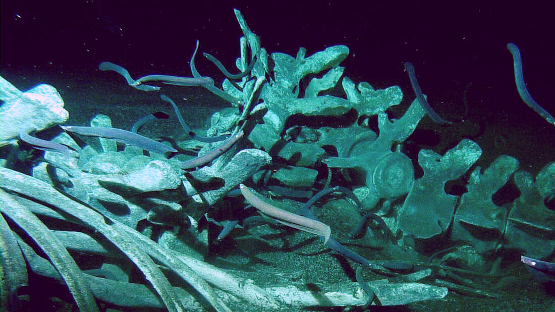
Whale Carcasses

From birth to death, whales belong to nature. These ancient creatures come back to the ocean and their bodies benefit other sea species. Evi...