Wednesday 30 October 2019

Website Creation: Reflection


There was one important thing I forgot to do; I did not remember to check my website by using the mobile version. I need to remind myself next time because I found some text was not fitting in when I changed the version. People used to work on mobile phones nowadays, they often do research online. Therefore I need to make sure my works and text are in the correct format and it is clear to read.

Another thing is, I should try Photoshop next time for fixing background colours. Clone Stamp Tool in Photoshop helps me to do this job efficiently and it makes the background looks more natural. Although I still can use Sketchbook on my iPad Pro, Photoshop is more professional. Here is an example shows how I used the clone stamp tool to edit its background.


Moreover, I think the organisation of my gallery is not good enough. I changed their position and put the images in the same series together, they look fine but it was not the best way to illustrate. Then I looked at two textiles designers' website page and I learned about what is the better way to show pictures. A screenshot by using the snipping tool shows below.

Here is Lucienne Day's Gallery page. It is very clear and her work separated in different series. It is easy to use that I just need to click in the name of these series that I can access her work. So I am going to make some changes to my Gallery to improve it. Besides, I will continue to discuss what I do like and dislike about their website on the next blog.


Tuesday 29 October 2019

Website Creation: Gallery

The Gallery is one of the most important parts of the website. I paid the most attention editing photographs by using editing apps like PhotoScapes, Photos edit tools in MacBook Pro, Photoshop, etc. I have not tried Photoshop yet but I will use it when I edit some pictures in the Gallery later.

First of all, I was looking for a gallery can show them nicely. Therefore, I used the editing tools on Wix.com.

I selected one of the galleries to see how it works with the pictures. I think it looks fine, however, some of them lose important elements.


I do not like the first version, so I deleted it and created a new one.

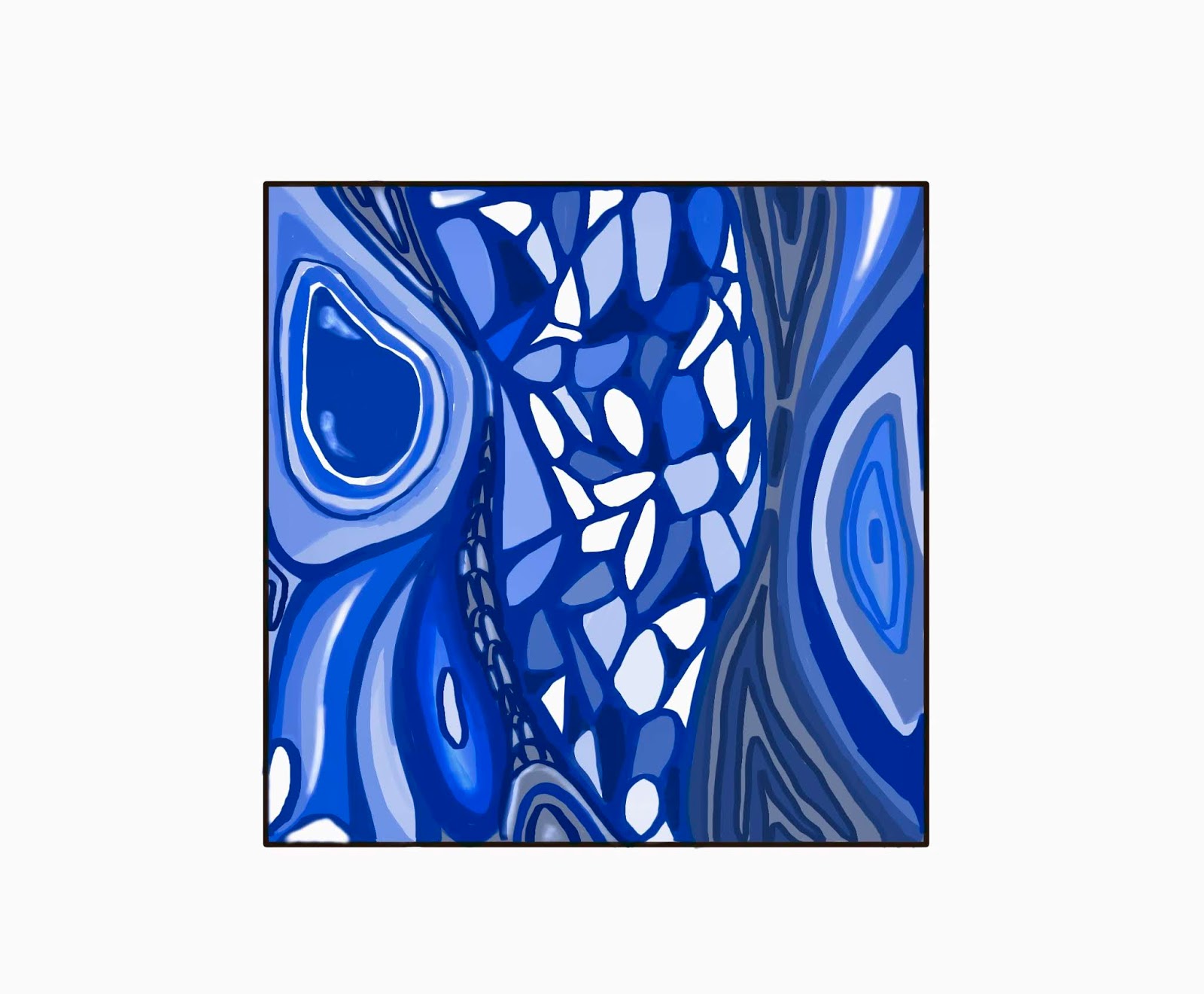
I interested in photography techniques, then I have played with different colour tones, films and light. Here is an example shows how I made the picture looks better and let it works with other images that in the same series.


I made a stronger contrast in this poppyhead and changed a Film/Duotone named STREET FOOD.  It provided old feeling and yellowy colours. I let it link to the pomegranate which shared the same topic with it, also match up the mushrooms. As the picture shows, it works.


Moreover, I clicked in 'change image' that I can organise my gallery. It was a very useful tool. I dragged pictures and organised them together to look like a series. There is a crop tool on Wix.com. I used it to crop picture (like this example shows below)which has edges with other colours. It is very convenient, I can find it after I uploaded to the gallery. It also helps to rotate the image, detailed in degree. Therefore I do not need to edit the images to Photoshop and drag them back to Wix.com.


But sometimes it can't help if the work is complicated. For instances, if I did not take photographs vertically, I can not use the crop tool on Wix.com unless the pictures might lose information. 


However, PhotoScapes X helps with this problem. I dragged the photos to my laptop(MacBook Pro). It has a special crop tool setting called Perspective Crop. It allows me to drag the blue dots in the right positions to create a frame that I would not crop important messages away. One more example here. This tool lets my Gallery looks more professional and organised.


Appropriate size and clear edge are not enough for a high-quality portfolio, then I changed the film and colour contrast for this photo. It looks brighter and the colours are fresher. Nice try.


Moreover, there are some photographs with messy backgrounds. So I need to cover the colours I do not want to include.  I airdropped this photo to my iPad Pro and used Sketchbook to edit it. I have chosen a marker and selected a colour of the shadow in the background. The reason why I used marker is I think marker provides a thicker texture that it might be a good tool to cover other colours. 


After that, I airdropped it back to Macbook Pro. I uploaded it to Wix.com and used the crop tool to cut the extra colour around the edges. It looks much better on the website now.


I will write a reflection later, check on the next blog.

Website Creation: About page and Contact page

After I finished customising my Home page, I moved on About page to change the image and began to write my Bio. I added my Logo to the left-hand side column, but I will change to my portrait photograph later. I wanted to make this page simple, so I keep the background blank which would work well with the text and image.


I changed the font for Helvetica Bold which looks clear and easier to read. I did not choose a font like  TREND because I think it might make confusion and it looks so different from Reklame Script which  I used for the title and sub-title.

In addition, I created a Contact page. I decided to make it separately that it is easier to navigate for the viewers.


I tried to types of text. Then I selected the same type of text as the heading of my website.


Moreover, I changed the contact form in purple, which is the type the same as the buttons I used for Gallery.


I also check the preview and see whether the Submit button works.


At last, I added a welcome sentence above the contact form. It looks more friendly to the viewers.

Website Creation: Vector Art


The title is clear and it's s in an appropriate position now. Then I started to customise other parts. However, I found out Wix does not allows me to change the vector art, but I still want to create one by myself. Therefore, I reduced the vector art opacity to 0% to block the light. Therefore it looks like to disappear. I placed it in the corner to make space for my vector art. I drew the design and added it on the Home page as an image. Followed by making it small scale as a Logo.


I used an Apple-pencil to draw by using an app called Sketchbook in an iPad Pro. Firstly, I decided to use purple as the background colour. Secondly, I drew out my design by using a ruler to help me with straight lines. This App also has a tool to make a square, how convenient.


I Airdropped it to a MacBook Pro and dragged this image to PhotoScape X to crop the extra area away to make it looks like vector art. I was very delighted with it. It is simple but has meaning behind it. One of my favourite Japanese animations is 'No Game No Life' and I love the main characters, they are step-siblings, Sora and Shiro. They are the two form the undefeated gaming identity Blank (空白 Kūhaku, stylized as『 』) due to their trademark of using only spaces as their in-game names. (Source on Wikipedia) Their name pronounced in Chinese is Kòng Bái. I have used the abbreviation, KB as the signature for each artwork I produced. No hard to imagine, I drew KB in a square and added a circle to the letter 'K' to make it looks more interesting. That's the whole process how did I create this Logo. I quite enjoyed designing signature geometrically.

References: No Game No Life, Japanese animation, Vector Art inspiration, https://en.wikipedia.org/wiki/No_Game_No_Life


Sunday 27 October 2019

Textiles illustration: Blue

'Blue Butterfly', illustration, Evelyn(2019)

Here is a sketch for my major project. I named it 'Blue Butterfly' because I got the inspiration from patterns on butterflies' wings. This design links to my initial idea and I think it works well in blue. Blue can be found in nature such as the pale blue of a daylight sky and rich dark blue of a deep pool of water. In psychology claims that is the reason why blue let people feel calm and peaceful. I think it also shows the feeling of butterflies. I think it was a quite nice combination of blue and patterns of butterflies' wings. Also, I left some parts blank because it would not look boring if the whole piece filled with blue colours. This is my initial design and I think it works quite well.

Besides, blue is often seen as a sign of stability and reliability. Businesses often apply blue in their advertising and marketing efforts if they want to project the image of security. By using this idea, I will create a sketch here. I made an advert poster about the airport express. It matches the report of psychology. The airport express is a transport that blue can gives a sign of safety.


First, I continue to use the SketchBook in iPad Pro. I created a second layer that I can draw a same size square as the first one. Then I have chosen to use a ruler to draw straight lines.


Besides, I wanted to make clear edges so I did not fill the colour with a brush. I used the 'Fill' tool to colour the square in blue.

The same step, continue to create squares or rectangles with the shape tool. 

Fill the ground colour with deep blue. I think it is a strong contrast that the viewer can see what exactly in the picture. I used 'third rule' in Art, which provided nice composition between the sky and the ground.

A simple illustration was done. The blue colours make the image calm and it works well for the feeling of safety. Moreover, 'Blue' is not only a colour, but it is also a mood of a person, means for melancholy, sad or depressed. Therefore, I combined this meaning to a blue flower. I was inspired by the shape of these flowers. They are facing down, just like sad people's heads. I created another layer in the SketchBook.
I drew a branch of flowers then I realized it was too simple. Then I added a few more shadows of decaying blue flowers at the back, it looks much nicer and I found it a little bit similar to  Lindsay Phillip Butterfield's work. It was kind of 2D illustration style. Flat colours and clear outlines. Here is an example of Lindsay Phillip Butterfield's work.


Poppies furnishing fabric, designed by Lindsay Phillip Butterfield for Turnbull & Stockdale Ltd., 1901, England. Museum no. CIRC.270-1958. © Victoria and Albert Museum, London

References: BURST.D.(2018) How can use psychology of colors when marketing, https://smallbiztrends.com/2014/06/psychology-of-colors.html
CHERRY.K.(2019) https://www.verywellmind.com/the-color-psychology-of-blue-2795815
KRAMER.L.(2019) How to use colors in marketing and advertising, https://99designs.co.uk/blog/tips/colors-marketing-advertising/
PHILIP.L.(1901)Poppies furnishing fabric, https://www.vam.ac.uk/articles/pattern-design-after-william-morris


Website creation: Get Started

I started to create my own website page named 'Evelyn Chow Art, Textiles & Photography '. It includes a Home page, Portfolio page and information page about me. In this blog, I will demonstrate how did I complete these sections.

I have signed up for a new account on Wix Website and began to edit it.

Click on this link for my website page: https://elin75zero.wixsite.com/mysite 

Some screenshots to show my working steps:


This is the front page of Wix Website where I can click to Get Started.


Then, I logged in with Google account.


I have chosen textiles design as the template, which is my major course. 


This picture shows a basic design of About me page that was provided by Wix website. It convened me to design the composition of the text and photographs. It allows me to reference the designs and colour combinations.


I started to edit and customise all the Wix template images and pick a layout that is appropriate for my continuation route. I replaced the pictures provided by wix.com and added my design images. The picture shows below: I changed the background strip to an image provided by Wix.com that I can see what the text look like in different colours. For this example, it shows black does not work well on this kind of green colours. Not sure about the design of the title, I will continue to think about it.


I clicked on the left-side menu and created pages I needed. First of all, I worked on the basic tones of my Home page. I did some experiments to figure out which background colour matches well with the text. Then, I had a play with different animations, just tried to make this page interesting. When I got used to WIX Basic navigational Tools, I began to create the Home page.


I customised the Home page with my own picture. I made the text in black, then I found it merely cannot see on this background. Therefore, I changed it in different colours and I thought a sharp purple can stand out of the background. But I didn't think it matches the tone of whole page design, so I finally decided to use black. It still did not looks like a successful front-page title, I was not satisfied with it. 

In order to let the title stand out, I changed the image opacity. The colours became darker which helped text stand out a little bit. It was a useful way. But it still was not the outcome I expected. I kept trying to find the best position for it.


I moved it up to the top afterwards. There was a significant improvement on this page and it cheered me up. I also changed the copyright to my own and it shows at the bottom of each page.

Whale Carcasses

From birth to death, whales belong to nature. These ancient creatures come back to the ocean and their bodies benefit other sea species. Evi...