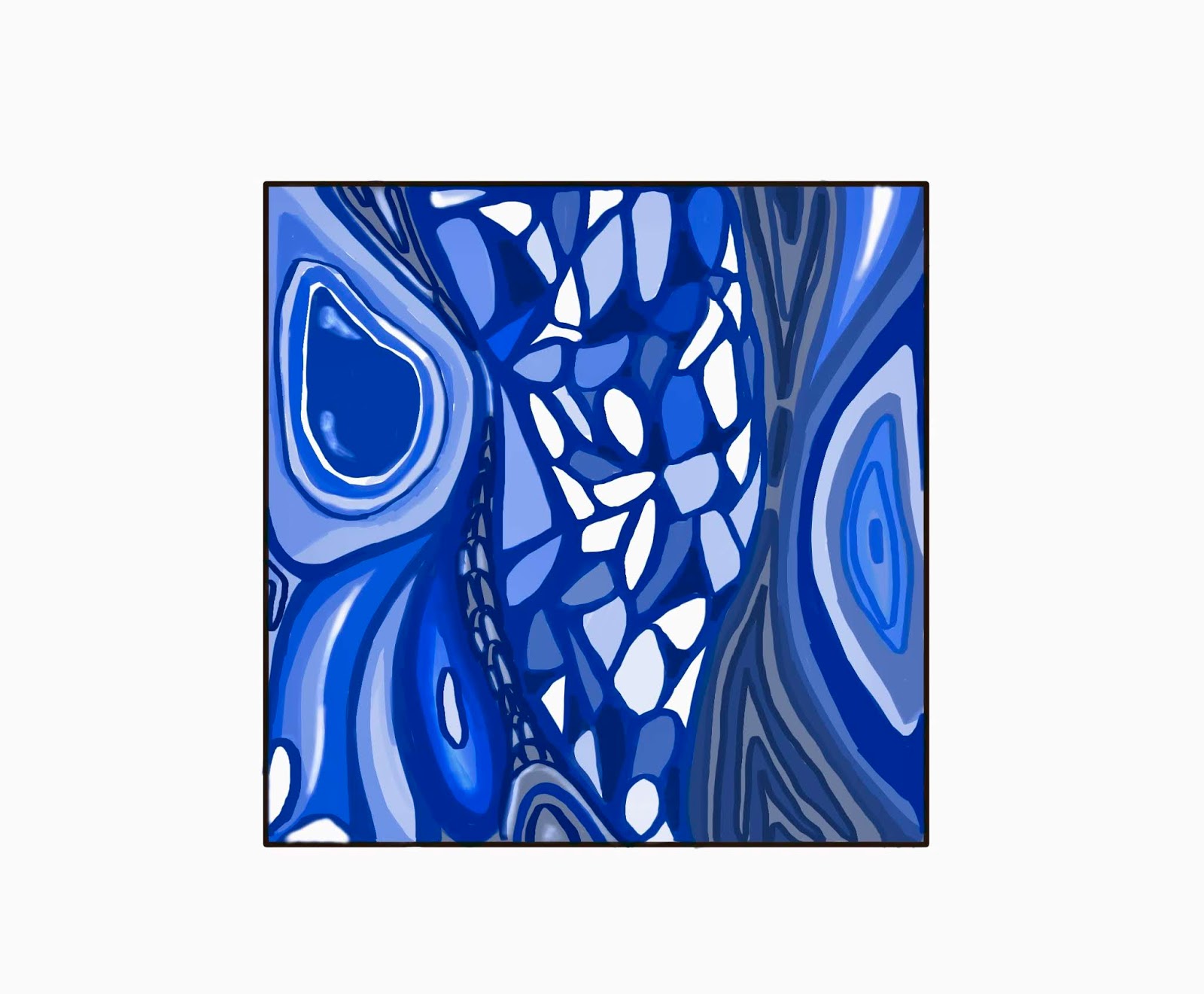
'Blue Butterfly', illustration, Evelyn(2019)
Besides, blue is often seen as a sign of stability and reliability. Businesses often apply blue in their advertising and marketing efforts if they want to project the image of security. By using this idea, I will create a sketch here. I made an advert poster about the airport express. It matches the report of psychology. The airport express is a transport that blue can gives a sign of safety.

First, I continue to use the SketchBook in iPad Pro. I created a second layer that I can draw a same size square as the first one. Then I have chosen to use a ruler to draw straight lines.

Besides, I wanted to make clear edges so I did not fill the colour with a brush. I used the 'Fill' tool to colour the square in blue.

The same step, continue to create squares or rectangles with the shape tool.

Fill the ground colour with deep blue. I think it is a strong contrast that the viewer can see what exactly in the picture. I used 'third rule' in Art, which provided nice composition between the sky and the ground.

A simple illustration was done. The blue colours make the image calm and it works well for the feeling of safety. Moreover, 'Blue' is not only a colour, but it is also a mood of a person, means for melancholy, sad or depressed. Therefore, I combined this meaning to a blue flower. I was inspired by the shape of these flowers. They are facing down, just like sad people's heads. I created another layer in the SketchBook.

I drew a branch of flowers then I realized it was too simple. Then I added a few more shadows of decaying blue flowers at the back, it looks much nicer and I found it a little bit similar to Lindsay Phillip Butterfield's work. It was kind of 2D illustration style. Flat colours and clear outlines. Here is an example of Lindsay Phillip Butterfield's work.

References: BURST.D.(2018) How can use psychology of colors when marketing, https://smallbiztrends.com/2014/06/psychology-of-colors.html
CHERRY.K.(2019) https://www.verywellmind.com/the-color-psychology-of-blue-2795815
KRAMER.L.(2019) How to use colors in marketing and advertising, https://99designs.co.uk/blog/tips/colors-marketing-advertising/
PHILIP.L.(1901)Poppies furnishing fabric, https://www.vam.ac.uk/articles/pattern-design-after-william-morris


No comments:
Post a Comment