Tuesday 26 November 2019

A link to Yumpu Flip Book

Here is the work process of creating a presentation about my major project. I made this presentation and all customisations in Pages on my laptop.


I changed the texture of this in PhotoScape X and set a lowe opacity that viewers can see the text clearly.


I made two more backgrounds. These colours relate to my works.


I uploaded these pages to the Yumpu website and filled some basic information.

Here is a link for you to see the FlipBook, https://www.yumpu.com/en/document/read/62943152/a-flip-book-colour-emotions

Sunday 24 November 2019

Major project: Final pieces


This is the sketch to make sure whether the pattern on garment works. I design a Kimono, it is also an element shows Royalty.


It can not show clearly here. I enlarged the pattern and made it as a background. Then I rubbed out the first layer which the layer underneath showed off. In order to make a difference, I set the second layer with a lower opacity level.

The outcome does not look good enough here. I changed the background in black to help the garment stand out a bit. Also added a 'crest' at the bottom of this garment. I am still considering whether the wool/yarn combines well with the feathers on actual work.


I got the idea of using real feathers was inspired by this photograph. I took it in V&A Museum when I was travelling in London.


This is my favourites piece. I used pattern of zebra for the jumper at the top. And I changed the size of my pen to create different textures. Also, the black see-through tight tilts the balance between black skirt and long whit dress.

This piece I combined all elements. Butterflies, Zebra and cheetah.


This one is specifically based on the butterfly's pattern. Still working on, will be added later. Besides,  I will add all these final pieces to my website gallery, also make a presentation through Yumpu Book.


Major project: Final pieces work process

Some screenshots here to show new techniques I learnt and how I apply them to my designs. The final pieces will be shown on the next blog.


On the first layer, I sketched out a figure on iPad Pro, Sketchbook (app).


Then, I created the second layer and added drew a garment design.


On the third layer, I started to add colours. This is a new tool I found in Sketchbook, it called ' Linear Fill'. It provides transitions of colours.

I decided to use the pattern of the sun for the top.


I think the colours are too bright, then I reduce to a lower opacity.


In case something happened, I did all the experiments on another layer.


Moreover, I wanted to show what pattern I have used on the side columns. Therefore, I used the 'Lasso' tool to cut a section out of the belt. It is something similar to the 'Magic Wand Tool' in Illustrator.


Then I dragged it out.


I copied and pasted it to another layer.


It does not fit in the circle. I changed the opacity level and it let me rub the extra bit out as I can see where is the edge of the circle.


Same method for others.


Then I will move on to the next post and show six final designs. Also, I will add descriptions to them that you can see how I develop my ideas.

Major project: Designers research

Apart from Kawakubo Rei, I have searched a few more designers.


Cecilia Langemar is a Fashion & Textiles designer and Print Lecturer. She has strong creative direction, project management and communication skills through her experience within the Fashion Industry and Higher Education. This picture shows some of her designs. I very like the traces of these colour drawing. Besides, the black outlines look like Chinese ink paintings. I think this kind of style might be suitable that it is illustrational drawing with two-dimensional effect, might be shown nicely as a print.


Elena Stonaker is an American fine artist and designer . Her soft sculpture and wearable artworks have been described as evoking "a shamanistic aesthetic", through the use of quilting techniques, beading, and myth-based narratives. I very like the textures she creates. The Appliqué really works on the garments. It does not like Trapunto, Appliqué gives effect between 2D and 3D cause it just lifts up a bit. It looks very nice for abstract art. I would use this idea in my design, shows below. Also, I think couching can be used to give more textures. I found inspirations in her work then created this garment design by using a lot of bright colours.


In her designs, I can see how she combines different textiles techniques, beading, couching, embroidery, etc. She creates rich colours and original designs.


References: Langemar.C.(n.d.) [online] https://uk.linkedin.com/in/cecilia-langemar-606790140
Stonaker.E.(n.d.) [online] http://www.elenastonaker.com/wearable

Major project: Further research

Since Charlotte advises me to create garment designs, I started to look at some designers' work. Here is one of the collections from Kawakubo.
'Kawakubo’s nonconformist clothes are the visible expressions of her inner life, a passionate cauldron of ideas, feelings, and intuitions. For Spring 1992, she showed garments that looked like the paper patterns of clothes rather than the actual cloth clothes themselves, and for Spring 1997, she sent out outfits with outrageously bulbous lump-and-bump padding, genuinely stunning (and, in some cases, horrifying) an audience that you’d expect to be unflappable.' (VOGUE, 2019)

I was attracted by textures of her fabric design. She combined 2D and 3D effect, like the clothes in the middle, she used fabric print, but the one on right-hand side is more three dimensional.


Moreover, this designs has flat and repeat patterns, let me associate Kusama Yayoi's pattern design. It may be a good inspiration for my major project. Also, the strong contract between these bright colours also works in my theme.


More examples here.


References: Kawakubo.R. (1942) Comme des Garçons. [online] https://www.vogue.com/fashion-shows/designer/comme-des-garcons. [viewed] 14/11/19
[viewed] 24/11/19
Yayoi.K. (1929) BRITISH SIGN LANGUAGE TALK: YAYOI KUSAMA. [online] https://www.tate.org.uk/whats-on/tate-modern/talk/british-sign-language-talk-yayoi-kusama. [viewed] 24/11/19

Major project: Additional sources


I have borrowed this book from DMU Kimberlin Library. Since I have done any digital paintings before, it is a very helpful book for me as a beginner. This book was published by Laurence King Publishing in 2009 and the writers are Melanie Bowles and Ceri Isaac. This book tells about the textiles and fashion industry. Designers started working digitally in order to catch up with graphic designers. There are rich range of illustrations include photographs and screenshots of inspirational textiles designs. It provides the know-how for students who with to use Adobe Photoshop and Illustrator as design tools. It is easy to follow, work processes illustrated step by step. The book also examines how designers can access the new technique, looking at the work of those currently exploring its possibilities, and provides an insight into the technology involved in digital textile printing.

Moreover, I attended a Photoshop workshop and Illustrator workshop it helps if I do not understand clearly the knowledge in this book that I can ask tutor for help. But the time was limited in workshop, this book is beneficial for spare time reading.

For my major project, I do not have enough time to read and experience all different digital tools mentioned in this book. But I think it still useful in the future, will read it in free time. Although I have not used many of those techniques, but some of them, such as Magic Wand Tool, Pen Tool and Add Anchor point Tool, etc, in Illustrator. Moreover, Clone Stamp in Photoshop.


The experiment I have done in the workshop was a bout replacing colours from the original image by 2D colours. I used the Curvature Tool to create curves by adding anchor points . The length and slope of the direction lines determine the shape of the curve. I created a lot of anchor points at the first time in order to get more accurate shape. However, I realised it was difficult to edit afterwards and hard to match two colours. Therefore, I selected another pen tool to reduce the extra anchor points to keep image simple. Its colours matches better as the picture shows.


This is another Pen Tool which can provides straight lines. I used the Gradient Tool to fill colours in the shapes I have created. If the Fill Tool only allows to choose one colour, but two or three colours for the Gradient Tool. It makes nice transition.

Major project: Sketches

I created some sketches for my major project. They are six pattern designs inspired by natural forms.


This picture shows elements took from a butterfly's wing. I wanted to show a feeling of calming. Some of us may remember childhood holiday spent watching butterflies. In my case, it was the school travel day in primary school. I was having picnic with other children on the grasses, butterflies are around us. One very beautiful blue butterfly was fluttering its wings and remained there until I moved my arm. It was like enjoying the sunshine with us. How a calming and lovely sunny day. I have never felt that before, the warm sunshine and beautiful creatures. I learnt sometimes we just need to calm ourselves then we might not miss any interesting things surrounding. My second defining moment with butterflies was looking at their wings in a collection glass box. It was a chance that I visit a museum with my family. There was an exhibition of various specimens. I was shocked by the extremely patterns on the butterflies's wings. Their wings are actually a weaving so intricate and looked like dedicated art of glasses. Therefore I used blue as the major colour, in order to create calmness. Also, this image created by small pieces. I wanted to show details of the pattern.


If people say butterfly, I might associate flowers. I tried to show calmness in a different angle. I think the idea of the composition of this image is fine, just need more details as Lindsay Philip's work. It may be better to work further.


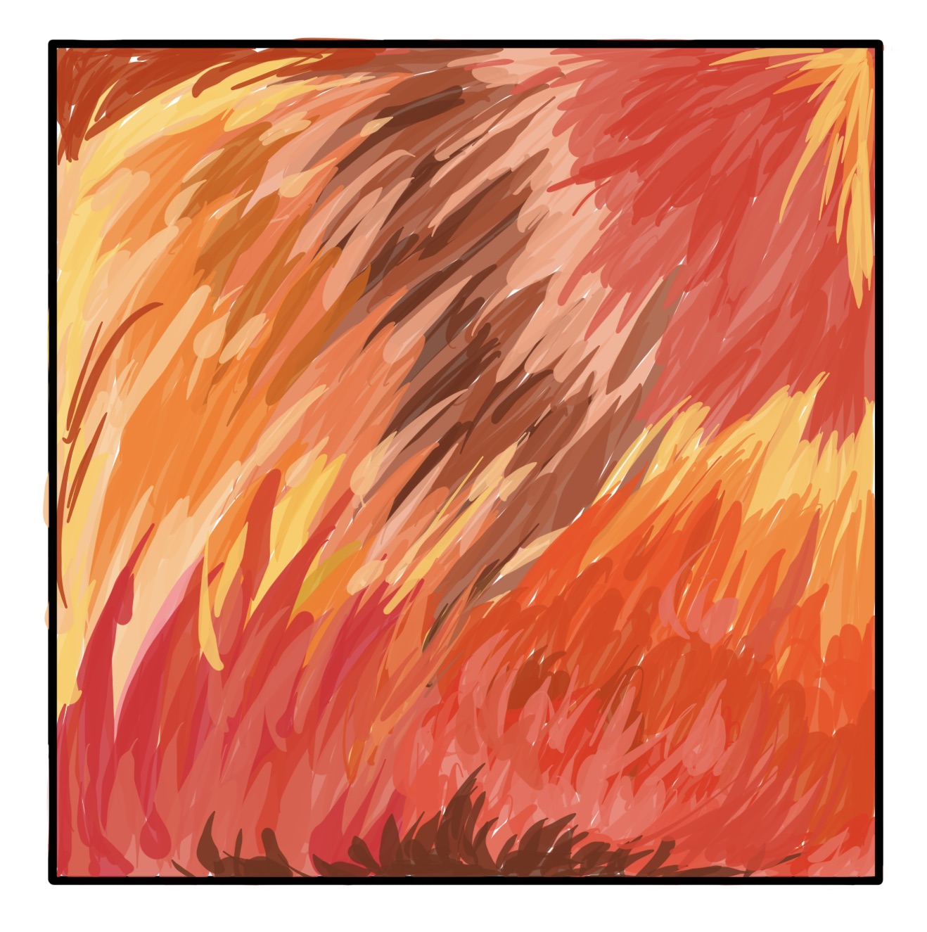
When I was drawing this image on my iPad Pro. I was struggling with the transition fo these three colours. Then I discovered a tool call Linear Fill, it allows to transition from red at the top to yellow at the bottom.

When I was thinking about warmth, energy, love, excitement, enthusiasm or attention, it might be somethings in red, yellow or orange. Red is a bright, warm colour that evokes strong emotions. It lets us to associate love, warmth and comfort. Red in text always use for warning or highlighting. Then, I combined these three colours and thought the Sun is a representative object for this topic. However, this sketch was not successful. It is too simple and does not look like a professional textiles print. I will consider work further on this piece or create another one.


I inspired by colours on rooster's feathers. Different from hens, their feathers are more colourful.

 I took elements from a peacock and used shapes and patterns of its feathers. I created a yellow green background that the patterns can stand out. According to an article, peacock symbolism: Vision, Royalty, Spirituality, Awakening, Guidance, Protection, & Watchfulness. I though yellow might be more suitable colour to represent Royalty, then I used yellow green to instead of green for the background. I am satisfied with this design. But when I ask Charlotte's opinion, she thinks it is not exciting enough, I should consider garment design rather than just pattern design.

This design is bases on pattern of zebras. I think it might be interesting if I not only work on colours. Black & White also an attractive topic to develop.
This idea is for wallhanging design and carpet design. It may be useful for train or bus companies to promote their business. Also can use for decoration.
I am satisfied with most of my work, but still think it should be improve. I do agree with Charlotte's suggestion that garment design is more beneficial for my major subject in University. The next blog will show further designers research and work process of final pieces.

References : j.m.s.(n.d.) Symbol: peacock. [online] https://www.mindbodyspirit-online.com/peacock.
[viewed] 24/11/19

Whale Carcasses

From birth to death, whales belong to nature. These ancient creatures come back to the ocean and their bodies benefit other sea species. Evi...