Wednesday 27 May 2020

Art Portfolio: Improvement

I made certain improvements to my website and portfolio. This blog shows pictures of processes.


Considering the purpose of the HOME page, apart from adding a link to my new project in the welcome slides, I also added my previous projects. At the last slide, there is a link to about me page. I think it is a good way to invite people.

Besides, I changed the front cover and introduction. I added an explanation to this paragraph to show the reason that I have chosen this theme. It also includes my intention or feeling I what to show to the audiences. I changed the word 'art' to 'fashion' to make my project more specific to fashion. For the cover page, I added some garment samples to the background. In order to keep it clear, I designed their position followed by 'Rule of Third', then the images would not look too crowded.


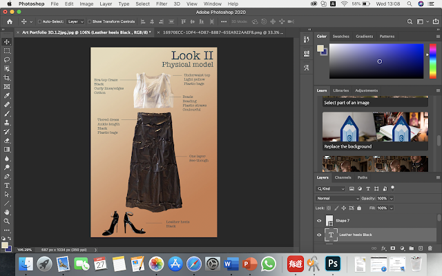
Because there is no model wearing the physical garment of look2, it looks a little bit flat. To make it more consistent to the gallery page, I added text to it and followed the format as others. And also a material page shows what materials I used; short, clear descriptions next to the images.


I used Photoshop on my laptop (Macbook Pro) to edit.

Tuesday 26 May 2020

Art Portfolio: Material page


This is a page shows materials I intended to use and I used for my project. To consider textual surfaces and functions, I have looked at articles demonstrates fabrics. For example, Hodakel's 'What is Denim Fabric' tells how different types of denim created and what they would look like or feel like.  Also, I have searched for suit fabrics suitable to wear in summer. Then I found Vailly, which is 100% linen and it is light and less warmth. Therefore, I decided to use it to create a suit for my spring collection. (Look1)

Reference:

HODAKEL, B. (2020) What is Denim Fabric: Properties, How it's Made and Where. [Online] Available from: denim-fabric. [Accessed by 26/05/20]

MOSS BROS (2020) A GUIDE TO SUMMER SUIT FABRICS. [Online] Available from: a-guide-to-summer-suit-fabrics. [Accessed by 26/05/20]

Sunday 24 May 2020

Art Portfolio: 3D piece


To test which technique works, I made experiments. I found it is difficult to sew on the white plastic shown above; so I decided to use glue to fix the straws. The picture in the middle shows three different layers; the first layer and the second one were hand-stitched. I found the first layer was easier to create and it is more three dimensional than the second one. Besides, I tried to use two pieces of white plastic to give volume. It did not work as it is flattened. As a result, the first layer shows the best effect. However, I want to make as similar to my original design, so I chose the second pattern. I hope it will look better on a big scale. I thought it did not look good because it was not thick enough. Then I made a sample using fabric. I found it is the problem of the way to stitch. If I screw them a bit, it may have an effect like the first layer.

I started to make a plan for creating the 3D piece; I noted down ratios of each piece.
I made a shape of the top roughly then I hanged it up. I began to make the shape more accurate and use double-sided tape to stick edges. I was not able to apply clean edges with s scissor, so I changed to use a cutting knife. I cut straws into small pieces and used a glove gun to stick them. 
I placed plastic on the floor because it was easier to work on big scaled pieces.
I photographed the working process using a mobile phone and upload them to my laptop. I created a contact sheet on Photoshop.

Then I selected the best image and started to edit it on Photoshop to create a final piece. First I used the object selection tool to crop out the background and used a colour background to replace it. Then I used the eraser tool to make clean edges.
I found a very useful tool, 'Eyesdropper' that it helps me to find an accurate colour that I wanted.
This is the final outcome of the 3D dress. I uploaded it to my website's gallery which as my portfolio. The link of my website: website

Friday 22 May 2020

Art Portfolio: Website Gallery

This blog is about the creation of my website gallery.
Firstly, I added a welcome slide on the HOME page to invite audiences to see my latest collection. Here has a bottom connects to the portfolio page.

This is the portfolio page. I used the same background on the welcome slide, to make it consistent. I decided to use one of the grid galleries, Masonry. It is because my designs are in vertical, Masonry allows to show all information of these pages. Otherwise, they may be cropped if I used a horizontal gallery. 

I clicked the images and changed their setting to just show titles of the work and they are open in a pop-up. Therefore, the gallery would not look too wordy for the first time and the audiences can check information afterworlds; when they click into the image.

This is the pros of the pop-up setting that viewers can see a bigger image and also the description with larger text.

Art Portfolio: Cover Page

This blog shows the working process of the cover page for my collection. The intention was to include 3D ad 2D elements. Firstly, I created a blank page in 'Sketchbook' to make a draft and to brainstorm ideas. I wrote down four main materials that I have used for 4 looks, gloves, forks, straws, and plastic bags. Then I decided the position of the title. It is a collection about fashion, therefore I used a similar idea of the fashion magazines to make one of my design to be the profile of this cover page. Then I copied and pasted the images to create a background. It looks not bad; it is colourful then makes the model stands out.


Here is the final version.

I added some fabrics to the background, such as the poms and denim.

Thursday 21 May 2020

Art Portfolio: Look4

This is the fourth look of my collection. The topic of this piece is the plastic bag; I used grey, grey-yellow, grey-blue, and black colour palette. To introduce from the top, a ruffle skirt, using the proportion of a tent dress, which the dress starts at the waistline. A ruffle; goffered frill of plastic pieces in grey on a garment around the neck, showing one side of shoulder. The middle part of this skirt is a stretchy cotton tube; wanted to make it comfortable to wear. The tube top connects the first layer underneath, which is in grey-blue. There are three layers of plastic pieces to create a ruffle skirt. The blue balls in the top to embellish that it makes this short dress cute and girly. However, a see-through net tight with black pearls gives a fashionable feeling; it drives people's attention and adds an element of fun and funkiness. To link back to the top, I added a pair of anklets sock with lace around the top; also some dots, but they are stretched so not like the balls. In the end, a pair of black leather heels turn back the feeling such as the bra top made by straws. they are solid and a little bit sexy. Overall, I very pleased with this design. I used some elements that are popular among young women. For example, a tent skirt with 3D balls. This idea came from my previous research, the blog named 'Further Research'. The anklets socks also add cutenesses to the whole look. I considered my target audiences are in a wide range year group; they are having psychological changes; most of them want to stay in a young image, however, they want to be mature as they think they are getting older. That's the reason I added a net tight and a bra top to this design. I think wearing a bra outside is innovative, so I added a top to this dress; it was just the bra. The tight with beads is my favourite. I wanted to show something between cute and sexy. The first version of this net tight was without beads. I think it is too sexy and it looks like for party and night out. Then I added the black pearls. It became more suitable for my target audience and it is fashionable enough to neither walk on a city street or cat walk.

Wednesday 20 May 2020

Art Portfolio: Look2 & Look3

This blog shows look2 and look3 of my collection. This is the final layout and those pieces will be uploaded to my website; the portfolio will be shown as a gallery.


Look2 is which I had chosen to make into 3D. The topic of this design is plastic bags and I will use straws for embellishments on the under waist top. It is made from light yellow plastic bags that the bra top craze underneath can be seen. A large piece of plastic cut from bin bags is the first layer of the tiered dress; some additional thin lines to create second layers; it is ankle length. Combine with a pair of black leather heels; the whole collection focuses on sustainable fashion, however, I want it also fashionable and elegant enough to walk on the street in the city. That's why I decided on a leather texture.

More complicated design on look3. Let's start with the top; It is made by light yellow plastic bags, the same material as the under waist in look2; for the cuff and necklines. The main body part is denim, giving a strong texture to support the whole short jacket. On the right side, there is a big crazy patchwork pocket. No cuff on right; it is like a short croak. On the left of the neckline, there are some fork and hand stitch thread weaving. To consider the plastic fork is tough and easy to break, so I would like to replace them to trapunto in the shape of a fork to make it workable on the garment. Also cotton might be lighter. A bandeau top underneath is made from clinging films; wrap it around to create layers, the part with more films shows deeper colour. It is a 3D piece, showing the volume of plastic films. Considering it will be a real garment, then I would like to add a tube top made by stretch cotton. Then the surface of the bandeau could be cleaned by wipes and tube top can be washed. To make consistent designs, I used the idea of trousers from the jumpsuit in look1; cut the top then become long ankle-length trousers. A leather heels, but in Aegean colour which about the colour palette of the short jacket at the top.

Sunday 17 May 2020

Final Show: Market my show

In this blog, I am writing about my target audience and how I will market my show. It also includes an example of my invitation.

The first thing I considered was the demographics.

1. Age; My target audiences are aged in Generation Y. They were born in the 1980s and 1990s. 2. Gender; Female.

3. Race; My target market is Europe and Asia; therefore, Caucasian race and Mongolian race.

4. Marital status; No specific audiences.

5. Occupation; Students or work in the office.

6. Annual income; 3,000 pounds or more.

7. Education level; Graduated from University.

8. Living status (homeowner or renter); I think it does not matter, it depends on income.

I intended to sell high priced clothing, so I would most likely want to capture women with a high level of disposable income. For instance, the middle class or upper-middle-class; These groups of people who have higher managerial or professional job employment. For example, my predict price is around 1,00 pounds for a single piece of dress; the target audiences should have high salaries that they are able to afford the prices.

Then, I looked at Sociographics. This part is looking to target markets to the individual level; to know about people's personal needs, profile, attitude, social graphs, or friends. 'Sociographics are characteristics that influence the way people receive and perceive messages. This can also be directly related to the groups they belong to, that in turn define how your market behaves socially. This may then determine how your market engages with your business, products, services and brand.' (McEachran, 2011) It is like integration to the demographic and psychographic. (McEachran, 2011) Psychographic is looking at the needs, interests, activities of groups of people. For example, for younger aged women (University students), should have more colours, to make vivid garment designs. For age 27-33, designs should be simple, no more than three colours on clothing. Designs might be more suitable for matured females. For the youngest group, I might add illustrations print on fabrics.

Picture from McEachran's article

There are many ways to gather and analyze psychographic data. For example, interview, questionnaires, social media, etc. I think those three are the most efficient ways. An interview gives flexibility. We can create questions at the movement while chatting with the audiences. A survey is also a nice way that it is quick to complete and easy to spread out. Depend on different locations, I can use neither paper questionnaires or online version. As social media are very popular nowadays, especially young people. So that social media is a platform to research the needs of target audiences and know about their interests.

Geographic is an important factor to be considered. I need to think people's needs from the region. I think my shop should locate in a city on the main street or near the main street. To consider major people are middle class and have a higher life level. For instance, people like going shopping in Leicester, some of them, especially young adults have habits shopping online. Also, the UK has much immigration so I think its easier to have a shop here that less problem of culture shock.

The behaviour of my target audience: they are more likely to use social media; they watch TV and access to the internet. Most of them extremely comfortable with mobile devices, but 32% still use a computer for purchases. (Kasasa.com, 2019) I think it is a good choice as 'millennials have less brand loyalty than previous generations.' (Kasasa.com, 2019) They buy product and features. It is easier for me to promote a new brand. If my products attract them then can bring attention to my brand. 

To invite people, I would like to use flyers or a video. I created a poster, however, to promote information about the final show, I think using flyers is more efficient. Posters are bigger than flyers and they are normally posted on a wall. That means the target audiences are easy to see them. I made a digital version, so people can see it online. However, flyers are smaller and they are handed out to individuals at a specific place where the audiences usually come. It has advantages. Flyers are easy to produce and cheaper. It is easy to read and people can get more information than reading a poster. 

I am planning to make a draft video to invite people to my show. It will include an introduction to my show; and some elements to attract people, such as showing some working process, cutting fabric or drawing sketches of designs. This is a short video shows a little bit of my working process of this collection as the example here. It also will include the process of creating practical clothing of the final versions. Then, there will be an interview as a conclusion; I made a draft of the interview.


In the background, there are some artworks. I would like to create depth of field to this video that makes sure the attention of audiences is on the main charater, which is me. The location is still my desk; as I filmed the working process here, just what to make the whole video more consistent. One the left, there will be a column shows images of my 2020 collection. On the right, a short introduction to me. I will make an invitation which to introduce my collection and myself to the audience and talk about my brand.


Reference:

McEachran, F. (2011) Understanding Sociographics in Market Research. [Online] Available from: Sociographic. [Accessed by 16/05/20]

Kasasa.com. (2019) Boomers, Gen X, Gen Y, and Gen Z Explained. [Online] Available from https://www.kasasa.com/articles/generations/gen-x-gen-y-gen-z [Accessed 16/05/2020]

Thursday 14 May 2020

Final Show: Artist Statement

In this blog, I will post an artist statement to describe my art. There are three main sections: What, Why, and How. I will tell what kind of work I do. Why is about my influences and inspirations. Also to analyse the unique process; how I made my works.

I will put a link here of a pro forma: Artist Statement. If you can not access the link, here is the picture of the Pro Forma. Considering it is an artist statement, I made it shorter then it is easier for audiences to read.


Final Show: Social Media Strategy

I am writing social media strategies for my show. At the early beginning, I wanted to use blogger to promote information; As I recorded my initial ideas, working processes, sketches, and research using blogger. Audiences can see as many as possible on here. However, I found it is not the most efficient way to promote products and my brand. Blogger is a nice platform that I can write formally and add unlimited images. It is easy to navigate, especially for people who are not familiar with using online systems. I also like its format. Blogger shows the title of the post, date, the author clearly, which protects the copyright; It provides who produced this work. It is good for a Business purpose.

However, something is not allowed, but Instagram can. For example, my favourite function, 'Story'. It is a similar concept to 'Snapchat'. I can upload images, videos, or audios to their 'story' to share what just happened at that moment. For example, I can open a live video, people who followed me can see what I am doing and I can interact with them. It provides a platform for me to interact with my audiences and it is a more interesting way than posting blogs. In the live video, audiences can type and send emojis. I can show my products there and ask for their opinions. And I could receive feedback in just one second. It is an efficient way to collect data; To know what do they like and to improve my designs or styles. What different form Snapchat is it keeps forever. Snapchat refreshes record daily, but in Instagram, I can find my story back and add to my personal page. That means the audiences can still see on my account after that day.

This is my public account, where I always share drawings or design ideas. In my profile, I added a link to my website. Under this link, it is a story highlight. It shows impressive stories I have shared before.


The image below shows a story I posted yesterday, an internet version. The mobile version is similar to the internet.  Each story plays around 6-7 seconds, it depends. If it is a video share, it would have a longer time. The second picture is a mobile version, it is full-screened. In the 'Story', I can check who had visited this story and I also can share it on Facebook or share it as a link to someone specifically to other social media, such as Whatsapp.


For the normal posts, it would be something to look like this. Image is on the left and text will show on right. Different from Blogger, I can add '#' to tag a title or a topic. If someone is interested in that topic then when he/she search for it, my post will show up. Also, I can tag someone or a company, a brand to see my post. Everything is fast and easy. 

I would like to use those two social platforms because they have different strengths. As my target market is young adults, they are more likely to use Instagram; So, it is easier and effective to promote my brand. The information spread quicker on Instagram. Another hand, if I want to cooperate with some brand or company, I need to provide information more professional. Then I need to use Blogger to make a project more completed.

To ensure the target audiences will access these social platforms, I researched 'Social Media Platforms and Demographics'. 'Owned by Facebook, Instagram has 600 million monthly active users with 150 million people using Instagram Stories every day. Although Facebook recently updated their user statistics, they didn’t update country-specific data so the last confirmed UK statistic stands at 14 million monthly active users, although this is likely to have increased. In terms of gender demographics, 68% of Instagrammers are female. Overall, 38% of female internet users are on Instagram compared with 26% of male internet users. 59% of internet users between the ages of 18 and 29 use Instagram and 33% of internet users between the ages of 30 and 49 use Instagram. According to one study, 17% of teenagers say that Instagram is the most important social media platform to them and 90% of users are under 35 years old.' It shows both Facebook and Instagram have a large number of users every day.

Reference:

LSE (2017) Social Media Platforms and Demographics. [Online] Available from: Social Media. [Accessed by 18/05/20]

Wednesday 13 May 2020

Art Portfolio: Development

I think this design is not impressive. Then, I created more sketches of the design of the bra-top craze. I think the 6th idea is the best; It is cute and suitable for generation Y women. I changed to the new design.

 I will combine four looks in one page and see whether they are consistent. 

Art Portfolio: Coloured Intended outcome


This blog shows the concept of my intended outcome. I added colours roughly on the initial sketches. These images show exactly my thought, which I have posted on the last blog. The first two looks are focusing on sharp colours; I would like to give a joyful feeling. I used the watercolour brush on 'Sketchbook' on iPad Pro and changed the layers to a lower opacity. That's why the colours look thin. It will give more volume on the final version.


As I planned, I decided to draw more details for look 3 and look 4. I think those two drawings work quite well. In the final pieces, I will draw carefully and use colours to show textures more accurately.

Tuesday 12 May 2020

Art Portfolio: Artist in Focus Research Pro Forma

I would like to analyse Susie McMurray's work particularly and I have created a Pro Forma. Here is the link: Pro Forma

Besides, I would like to show the initial sketches for my collection.


I finished colouring the first logo and it is on my last blog. I am going to draw the second one and test whether the colours work together. 


I quite like look 3 and look 4. However, they are much more complicated. Then, I will not consider to make it into 3D. They are more about textures. I will spend more time on the drawing details to show the textures instead out make a real version for those two designs. 

Final Show: Poster Concept Reflection

This blog will show my consideration of the typography of my poster. I will analyse how my poster changed and why I chose the typography.


This is the first version of my poster. It is not really commentary and it confuses audiences that they might not know what exactly this show is; about lights or fashion, due to there are no elements about fashion and textiles. Also, my logo seems to be not matched for this poster design. To keep my poster clear and consistent, I have created another poster also changed the typography. In the previous one, I used San Serifs for body copy, which is a clean, modern typeface gives clarity. I wanted to make content easy to read and contemporary. Besides, the heading was 'Zapfino', which is Scripted. It has an intricate style. I would like to give a feeling of creativity. However, these two types of font were not fitted together. I have considered again. Then, I decided to use only one font on the poster. This font is also Scripted, however, it is more squared. Considering the target audiences are in generation Y, I aimed to make the typography less mature than the first design. Also, I created a new background. I used pictures of clothing of my collection; The poster looks more connected to my subject area. Besides, I used the original colour palette from clothes to design a logo. It matches the poster, but I was not satisfied with it which looks like an official logo. It is too boring and the typography looks not professional enough.


Therefore, I changed to Serif; It is a traditional and authoritative typeface, subtly speaks quality and it is understated. This font gives a feeling between the previous two designs; is my intended outcome. It looks more elegant; is suitable for womenswear. A new background design illustrated fabrics, knits and some small LED lights; As they are small that I can show my inspirations, but not catching audiences' attention to it. I still can tell the theme of this show is about textiles. The huge improvement of this poster is the logo. I created a scripted version mixed with serifs. It looks more like a logo for a fashion brand; the colour also matches with the poster this time.


That's all my reflection for the creation of the poster for the final show. I will post my artist statement and introduction for my show on the next blog.

Tuesday 5 May 2020

Art Portfolio: Look 1

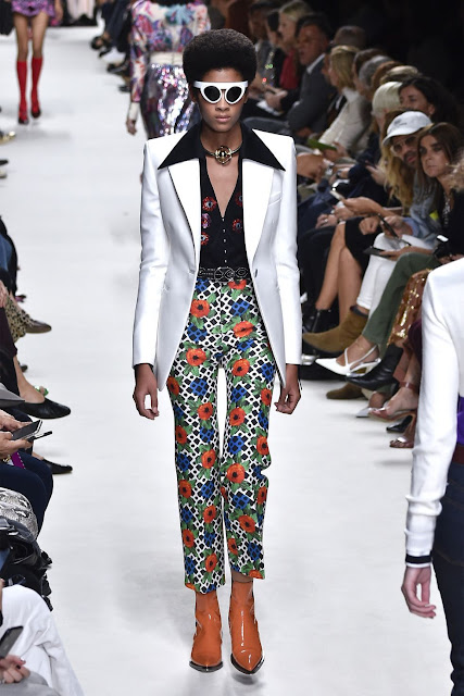
I have researched 2020 fashion trends on the website of BAZAAR. The disco comes back on the 2020 runways. Designs stand out with contrast colours and the contemporary button-downs designs. Here is an example of the disco collar. "The look is most impactful in jacket form—bonus points if it has a contrasting collar as seen on the Paco Rabanne runway." (Pieri, 2020)


PETER WHITEGETTY IMAGES

 My theme is substantial art that these are recycled gloves, such as kitchen gloves. My design shows a disco collar with two pairs of yellow plastic gloves. Appliqué used for cuffs and a pocket with reverse appliqué. To leave enough space for the pocket and avoid it looks crowed, I decided to make a smaller collar. A jumpsuit inside; where I would like to keep the whole design as a piece. A jumpsuit connects top and bottom- the ankle-length trousers made from plastic bags. I tend to use black leather high heels with thin lines that it can show as many as possible of the yellow plastic socks. Different from my initial sketches, I changed white gloves to yellow, which highlighter reel is one of the 2020 fashion trends. I think yellow is a sharper colour and more eye-catching.

ESTROPGETTY IMAGES

I experiment with an orange background, considering layouts for the final portfolio. I will continue to work on other design and post on blogger. I think this design is more original than the initial version; quite pleased with the outcome. I might need to change the presentation, make it more clear to read and reorganise the text.


I think this orange is too sharp; to make a better presentation, I toned down a bit.

Reference:

PIERI, K. (2020) 12 Standout Trends That Ruled the Spring 2020 Runways. [Online] Available from: 2020 fashion trends. [Accessed by 05/05/20]

Sunday 3 May 2020

Final Show: Logo Creation 2 & Reflection

This is the second post about my logo creation. Since the first try was not successful, I reflect my work and created some new ideas. This blog shows my new designs of logo and analysis my consideration.

I reflected the reasons why my previous logos did not work, there are two main points. Firstly, I have not thought about the target audiences. There is a relationship between target viewers and logo design. The first logo was funnier for the younger group of people. However, my target market is Generation Y women, so the logo needs to be more mature. Secondly, I demonstrated how the logo's idea came, why I used Japanese characters and where the inspirations come from. Thus, it made confusion. My market was international, so I think the name of the brand at least has English so that the audience can understand. Also, I considered the promotion of the company. The brand name needs to be clear and easy to remember. Then, I changed the Japanese to English letters. Using the pronunciation- KUHAKU.

Here are some examples of the new design. Thinking the logo needs to match the poster, I made samples with different colours.

I tried to find the colour palette of my last collection. The first front seems more suitable for young adults. Consider my the age group of my target audiences, people aged 25-33years old might be mature. So I think the second logo works better as it gives a feeling of elegant and more professional as a fashion brand logo.


I also experimented more background colours and symbols designs. I used a symbol to represent the letter 'A'. Besides, I added a logo related to textiles, such as thread. I quite like the front of the last logo, it is simple and fashionable.

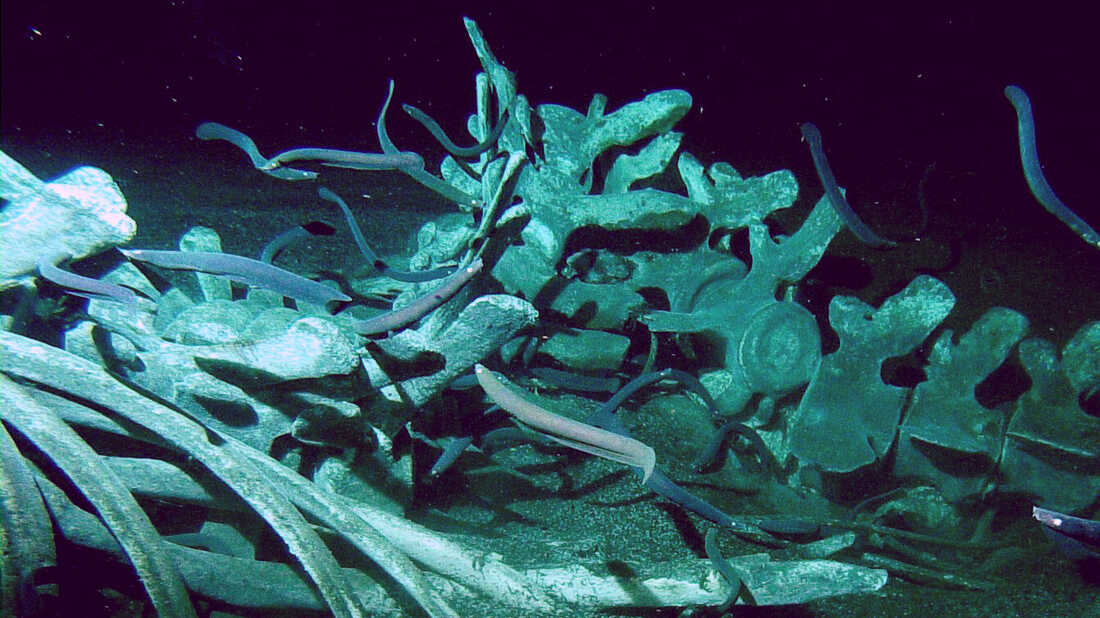
Whale Carcasses

From birth to death, whales belong to nature. These ancient creatures come back to the ocean and their bodies benefit other sea species. Evi...