Considering the purpose of the HOME page, apart from adding a link to my new project in the welcome slides, I also added my previous projects. At the last slide, there is a link to about me page. I think it is a good way to invite people.
Besides, I changed the front cover and introduction. I added an explanation to this paragraph to show the reason that I have chosen this theme. It also includes my intention or feeling I what to show to the audiences. I changed the word 'art' to 'fashion' to make my project more specific to fashion. For the cover page, I added some garment samples to the background. In order to keep it clear, I designed their position followed by 'Rule of Third', then the images would not look too crowded.
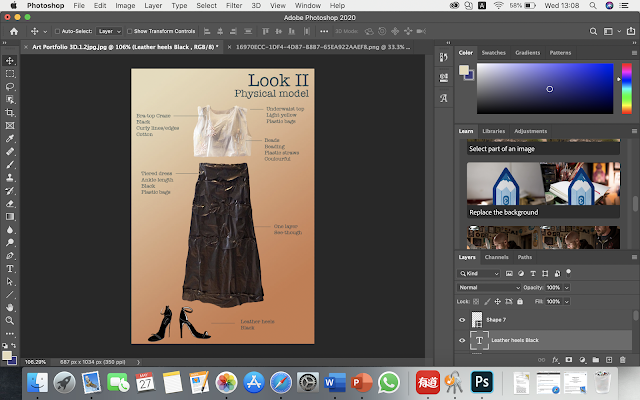
Because there is no model wearing the physical garment of look2, it looks a little bit flat. To make it more consistent to the gallery page, I added text to it and followed the format as others. And also a material page shows what materials I used; short, clear descriptions next to the images.
I used Photoshop on my laptop (Macbook Pro) to edit.


This is much better - well done for improving this!
ReplyDelete